Translate

Monday, April 28, 2014

Wayne's Old Farm, Perkins OK

A group of us took my wife's elderly uncle out to his old farm in Oklahoma so he could look around a bit.  I took  my Olympus OMD E-M10, and I think I got some photos he, and you, might like.

I used the Olympus Zuiko, DSLR lens 14-55 mm Mark I lens with the OLY DSLR to m4/3s adapter.  This was the first extended shoot I had with the combination where I wasn't trying to compare it with the kit lens, and I think it worked out well.  

The lens is a bit heavier and larger than the kit lens. And Auto-focus is slow enough that I personally found manual focus to be just as effective. 

The lens and camera combination is a bit out of balance.  It took me a while to find the right way to hold it and to work with it. Basically, I hold the camera to my eye, and I zoom with my left  hand and get 'some' idea of how I want to frame the photo.  Then I support the camera/lens combo by holding the barrel of the lens with my left hand with my index and middle finger extended out to the focus ring.

I depress the shutter button half way to auto-focus with my right hand, if I feel like it, but I have Fn2 button set up as manual focus, and I generally press it for M.F. (Right hand).  Manual focus is generally done with the index finger of my left hand (which is supporting the lens body combo).

I steady the camera body with my forehead, and right hand, frame and shoot.  It takes MUCH longer to describe than do!

I think the extra image quality it is worth the very tiny extra bit of hassle.  Follow the link here, Wayne's Old Farm, for all the other photos I am sharing.

#OMD #E-M10 #PerkinsOK #ManualFocus #Zuiko

Sunday, April 20, 2014

A Quick and Easy NR Technique

I've been researching on how to improve the noise control in ACDSee pro 7 for an ongoing series of articles I'm putting in this blog. 

Ironically, I felt the need to buy Topaz Denoise to have something to compare my results against, and some of the techniques found in DeNoise can actually be used in ACDSee Pro immediately. I would think it should work with any software that is able to de-saturate and then re-saturate a photo without losing anything color wise. I should think this would include Lightroom, CaptureOne, Aftershot Pro, and the like.

When in the Develop module, make all the changes you want to a color photo. And when you are ready for noise control, in the General section, under treatment, click on Black and White. This will immediately de-saturate your photo (don't worry, the color is safe). Then go into "Detail" and make your luminance noise adjustments. It is so much easier to see the luminance noise in a B&W photo and make adjustments with the color not getting in the way of your work. When your luminance adjustment is done, go back to the General section, under treatment and click "Color". Your photo is re-saturated like it was before. Now you can go back to the Detail sub-tab and adjust for any color noise. (The noise that is left is either color noise or the luminance noise you have chosen to not address)

I think it works so well because it allows you to easily identify the TYPE of noise you are dealing with in discrete steps and avoid spending time trying to find the "balance" between color and luminance noise.

Saturday, April 19, 2014

The Histogram

Incorporating the The Histogram into an ACDSee Pro 7 Workflow


This is the first in a series of articles where I provide a tour of the important raw development tools that ACDSee Pro offers. I'm not sure how many articles there will be in all.  It would seem this is a MUCH bigger task I have set myself than I originally thought.  Some of the future articles may wind up as video tutorials if that seems appropriate.  Part 2 of this series has been published and can be found here.

NOTE: While the comments specific to ACDSee Pro 7 are obviously unique to ACDSee Pro 7, the information and knowledge base on which those instructions were created are common to ALL editors and workflow tools. Non ACDSee users might well find that information useful. 

Please assume I am working in raw, and in the “Develop Tab” of ACDSee Pro 7. In many ways, the bit mapped edit tab offers greater control of lighting. But the use of raw among “serious” photographers is so great that I feel that is the best use of our time. 

Furthermore, we need to produce the best image possible from raw before creating a tif or jpg file of a photo before sending to a bit mapped editor. So if we CAN produce that quality photo in the “Develop Tab”, I think we should.

Exposure is a complex issue in post processing. It is more than merely making sure that the image isn’t TOO bright, or TOO dark. It also touches on tonality and color. Light is the foundation on which photography rests. If a photographer can’t control how that light is used, he or she can’t control how his or her images are perceived.

It is beyond the scope of this article to discuss how to get a good exposure with your camera. Post Processing control is complex enough. But any photographer is wise to learn all he or she can about getting a good initial capture. That makes post processing tasks much easier.

The uninspiring photo below will be our test photo for this tutorial.


The Histogram and Clipping View Toggle Switches


These controls reside at the top of the Develop Tab’s control window. The Histogram toggle is on the left, and the Clipping View Toggle is on the right (See image, immediately below)

The Histogram Icon and Control


This control’s Icon is blue when the Histogram is displayed as gray when not displayed, but since you can always see the histogram, when displayed, the color doesn't matter much, I guess!


The histogram is a reflection of all the changes you make to a given photo. There are three channels displayed as a line chart on an X-Y axis. It displays the number of pixels for each value of the selected channel. The vertical axis represents the number of pixels and ranges from zero to the highest number of pixels in the graph. The horizontal axis represents the value of the selected channel, from 0 to 255. 

Actually the maximum number can be greater than 255. “255” is the value for an 8 bit color depth color space such as found in jpg and other 8 bit images. Tiff and raw images can also be created with a 12, 14, or 16 bit color depth. And the broader the color depth, the number of shades of color is is increased exponentially. I have found though, that thinking of a maximum number of 255 seems easier to comprehend and doesn't affect the accuracy of how I use the histogram. 

Note that as the controls change, the histogram changes as well. 

The left portion of the histogram describes graphically how much of the photo is in the shadows.

The right portion of the histogram describes graphically how much of the photo is in the highlights.

The center portion of the histogram describes graphically how much of the photo lies within the mid tones.

The histogram is one of the most useful tools ACDSee offers that I have ever ignored up to this point. It is useful in that it allows you to better understand the complex relationship between light, dark, tonality, and color, without letting the emotional, artistic content misdirect your attention. 

As we work through the controls, I will continually refer back to the histogram to illustrate and help explain the changes that occur when the controls are set.

One thing I have noticed from writing a similar article for Corel Paint Shop Pro, is that histogram configuration is not universal. While the principles and goals of all histograms remain the same, how the developers of their respective programs choose to implement and display that photo information graphically can vary widely. 

If you are using a product other than ACDSee Pro, you will have to experiment a bit to understand how the publisher of your software chooses to display histogram information.  The principles I present in this article will likely remain true, however the detail will be a bit different.

My advice is to set your basic exposure information in one program, such as ACDSee Pro, and learn to use THAT histogram implementation well. If you leave the program that you have used to set exposure and lighting with a histogram and you feel the need to review the histogram, go BACK to the original program that you used to set your exposure with. Trying to interpret 2 or 3 different histogram implementations for the same photo can be confusing and lead to less than the desired results.

The Clipping View


This control’s Icon is to the right of the Histogram icon.  It is blue when the clipping display is turned on and is displayed as gray when not turned on. This color indicator is useful in that it isn’t always obvious when the display is turned on, so it is helpful to have this reminder.

This control can be activated either by mouse clicking the icon,or by pressing “E” on the keyboard.

Its function is to tell you what areas of your photo are either so dark or so light that no detailed information can be displayed or seen by the viewer. You may well think that you should be able to tell that bit of info, so why do you need an additional visual indication? 

It isn't always easy to see the clipped highlights and shadows on screen, and the correlation between the editing screen and a display screen or a print can vary widely. Things that you may not consider important at edit time might be very important at display time. This allows you to know this information with certainty.

Consider this Image. Other that straightening and cropping not editing has been done to it.


Note the Histogram, the shadows seem to be at their highest about ⅓ of the way from their absolute darkest. The highlights are not as high as the shadows, but at their peak, they are about ⅓ of the way from the absolute brightest. Now consider how I torture this photo:


I moved the contrast control all the way to the right. Note how anything that could be considered in the shadows is green, and much of what can be considered a highlight is red. What this means is, that anything that is now green has lost all detail, it is solid black, and anything in red has ALSO lost all detail, it is solid white. Also note how there isn't very much that isn't red or black, meaning those areas still have some detail in them.

But NOW, compare the two histograms above. In the first photo, there was a lot of area under the curves in the rough middle of the chart, but in the second, the level of the curves is very low in the middle and the curve at the absolute left show significant growth where before it was non-existent. A similar occurrence appears on the far right. Though smaller than that part of the curve on the left, a bigger area has no data at all than before.

What does all this mean? By sliding the contrast to the right, I increase the contrast. This is done by brightening the light areas as much as possible and by darkening the dark areas as much as possible so that both extremes lose any detail in them (solid black or solid white). That low level of curves that remains in the middle are those areas too dark to go fully white, and too bright to go fully dark. It is these areas that will show any detail. 

Below, see what the altered photo looks like without the clipping tool activated.  Not very pretty, is it?


Don’t worry, I won’t be showing this many before/after photos in subsequent articles, but I wanted you to see how these changes relate to the controls and how those changes will look like in a photo. And in the future, I will point out changes to to the Histogram as I address the various controls.

I hope you find this interesting and look forward to your comments.

Monday, April 14, 2014

Hey Canon! You might not be the future of Photography! Samsung may be the future!

I was in a "Best Buy" the other day for the first time in a VERY long time. Apparently the Apple Store concept is an influence on more than just Radio Shack. It wasn't nearly as loud, crowded and dirty as I remember. 

The Samsung Cameras had a totally separate and attractive display that had a permanent look about it and was not that far from the Samsung Phone displays. It is quite separate from the ubiquitous, and incredibly ugly, tethered Canikon display.   One appeared modern and able to keep up with changing times, while the other seemed sad, neglected, dusty, and out of touch.

The Samsung display offered examples of what seemed to be the entire Samsung camera line from simple P&S to the more complex enthusiast cameras.  While they were tethered, they were attractively offered, had all their lenses attached, and could be held and played with.

It would appear that Samsung is using it's dominance in Android phones to promote their other consumer lines.  And this may be the act that is far more important than merely producing a camera that is considered "good".   This may be how photography is defined and viewed in the future.

Samsung is a major player in the smartphone industry. Smartphones have probably been the single most important influence on personal computing and communications since the advent of the generic PC itself. I think the attitudes and usage standards that people are getting used to with their smartphones will spill over into other personal portable electronics, or subsume them completely.

This will without a doubt eventually affect how we perceive 'good' cameras. I'm not one of those people who believes that cameras outside of smartphones will disappear completely, but I do predict that they will be heavily influenced by the smartphone. 

We can already see this happening. My new Olympus E-M10 can connect to my Droid Bionic smartphone. It can use the phone to add GPS location data and upload the photo to an online storage service. AND the smartphone can act as a remote control for the camera. That camera is also only a small bit larger than my smartphone.  

The old guys, like me, with our Eugene Smith, Henri Cartier-Bresson, and Ansel Adams approach to photography are creeping ever closer to retirement or even checking out completely.  Our greater disposable income will be less and less able to influence the direction of photography as time wears us down!

Samsung is in the catbird seat to leverage their influence in the smartphone industry into achieving influence in the Photo industry via highly integrated photo/communications/computing systems.   In another forum, a user asked why aren't Samsung cameras more popular than they are?  Maybe a better question is why can't Canon and Nikon see the future and respond better to it?  Everyone involved with photography needs to understand that they are about to live thorough a pivot point in their industry.

Canon and Nikon need to keep an eye out on who is creeping up on them in this race!  In fact, you might say Canon and Nikon see this as a conventional motorcar race full of left turns.  All they have to do is build the fastest car.  I suspect Samsung sees what is happening is closer to building a whole new racetrack where a different kind of race can be run. I suspect we will be seeing some interesting changes in the next 10 years.

Saturday, April 12, 2014

The Return of The Local Camera Shop

I think the last REAL camera shop in Springfield, Illinois closed up in 1972 - or 1973. After that, all we had NO opportunity to buy photo gear locally until the "Big Box stores started to become prominent in the 1990's. And even with them, the only remotely 'serious' cameras you could see, handle and feel, were, for the most part, the entry level Canikon DSLRs. (Canon or Nikon).


If you were curious about anything else, you needed to schedule a trip to Peoria, Chicago, or St Louis. So many of us resorted to buying our equipment blind off the internet after pouring over any reviews we could find in the hopes of figuring out if the gear was remotely suitable to our needs. This is how I bought gear for a very long time. Most of my adult life really.

But about 18 months ago or so, by some miracle, a new camera shop opened up in Springfield! It was part of a small local St Louis based chain called "Creve Coeur Camera". I visited the place naturally, when it opened up, but to be honest, I didn't take it too seriously. Everyone knows the era of local camera shops is over, right? But I noticed that it DID carry the more 'serious' Olympus and Fuji cameras. Their stock, in my eyes, went up quite a bit. In addition to the ubiquitous Canon and Nikon brands, they were also showing some taste and judgement! (Don't be a hater, that was a joke).

As I became more aware of the new Olympus OMD E-M10, I could see it was "out of stock" most places and if it was "in stock" it was selling for pretty much list price. I felt that I would have to wait until the E-M10 was less popular to ever actually buy one. I didn't consider actually holding one, I knew that wasn't going to happen. Then I remembered "the new guy", maybe they could help me get one.

They not only COULD get me one, they had one in stock that I could actually hold and play with! No, I don't know if they've got any more, you'll have to ask them, but that's not the point of this post anyway!

My point is the camera shopping experience was SO much better than buying over the internet blind. I could hold the camera and see how it fit my hands. I could even try the camera out with my existing lenses. A most pleasant shopping experience. I paid cash for the E-M10 and a 4/3s to m4/3s lens converter. Since the camera was selling pretty much for list price everywhere, there wasn't a strong incentive for me to buy over the internet. 

The only extra cost was the State and local sales taxes. And the $75 extra, or so, I spent in those taxes, was fair compensation, I think, for the amount of time I spent testing out my 4/3s DSLR lenses, and other camera options before I bought. I'm pretty sure I was a complete PITA as I, went home, brought in all my existing gear and tried it out in the shop with no money changing hands.

I walked out of the shop knowing exactly how my current gear would work with my new E-M10 and how my photography would be affected overall. And I'm pretty sure THIS shop not only wanted my business but was interested in building a long term business relationship with me. I never felt like I was some sort of walking wallet to them.

The experience of shopping locally was so pleasant that I would encourage other people to give it a try. If you are younger than me, you might not even remember buying photo gear locally and just assume that anything like that would simply be too expensive. But it seems that the camera industry is starting to stabilize the prices at which new gear sells. More than the cheapest prices obviously, but nowhere near the high mark-up luxury prices of 40 years ago either.

Normally at this point, I would scream "price fixing!", but I wonder which is worse? Stable prices at a modest level but which helps insure your ability to CONVENIENTLY see, feel, and judge the merits of a given camera, or highly volatile prices that almost guarantee your first experience with a camera will be when you've paid for it and taken delivery?

Low LOW prices are fantastic. But can we really say, overall, they have worked to the consumer's advantage when all we can see and handle are entry level Canikons at the big box store? Maybe a national fixed(ish) price that isn't TOO high will serve us better in the long run. This opens up new opportunities not only for the return of local shops, but for consumers as well. 

There is an incentive for investor to spend money on creating brick an mortar shops, (which helps with local employment in the photo industry, and promotes local involvement and awareness of photography); and the buyer gets a much more convenient way to experience and evaluate a given camera or other gear.  How much is something like that worth?

Friday, April 11, 2014

How Raw Works

There seems to be a lot of misunderstanding of what raw is and how raw developers work. Once you get involved with raw on a long term basis, it is easy to forget exactly what it is you are doing when working with raw. Maybe it is time to review it again.

This is a VERY simplified explanation. I'm sure much more detail could be added to it, but I think it is adequate for a high level explanation.

The image you see on the screen in your raw editor already is a bit mapped conversion. Your raw conversion program displays the the image according to the default values built into it. The extra information is there in the raw file, but not displayed on screen. If the conversion no longer needs certain data to meet your needs, it is deleted from the on-screen representation, but not from the raw file itself.

As you make changes, your raw editor goes into the raw file and displays any additional information it needs to create the image as you want to see it. But at no time does the image you see on screen represent the ENTIRE set of data contained in the raw file. I suspect we would not recognize it as an image at all if it did.

As an ex DBA, I tend to think of raw images as a sort of mini database for the creation of a single image; not as the image itself. As you work with the image you read that database looking for the information you need to create the image.

Once you have altered the on-screen representation to your satisfaction, and you tell it to export or save to a tif file, what gets converted to tif is that onscreen representation. And this leaves behind any unused data in the raw file when the tif is created. And you would not see any loss in a good conversion compared to the onscreen representation.

This is why I claim that any conversion from raw to tiff is inherently 'lossy'. The raw development process is one of deciding WHAT raw data to use and what to leave behind. 

It is also why you always want to save your raw image files if you can. You never know when an alternate development and conversion will be useful.

Thursday, April 10, 2014

Olympus' Forty-nine Year Vision

I said the other day on a different website, that the OMD E-M10 is the camera Olympus has been trying to build since 1965.  And it's true, Olympus has always been pushing to create ever smaller, ever more functional small cameras, but technology has always stood in the may of this goal.

35mm half frame cameras of the early 1960's were great!, They were little gems of the jeweler's art.  Fast responsive and accurate.  The problem was that film technology just wasn't able to meet the needs of a half-frame camera.  I often wondered just how successful they would have been if film technology had been as good in 1965 as it was in the year 2000.

The early 35mm OM cameras were as small as technology would allow, the practical limitation of film size, primitive electronics coupled with mechanical linkages, and how quality optics were designed and built severely limited just how small a  camera an enthusiastic photographer would tolerate.

But now, technology is able to actually assist in this goal, not stand in the way.  And I think the pinnacle of this goal is the E-M10, and not the M1.

The OMD E-M1 is a fine camera, no question about it.  But it is a tool designed for the VERY serious photographer.  It is a bit larger, and has a feature set that, in a way, sits outside the parameters of the goals of the original dream as I understand them.

The goal was, as I understand it, was a "serious" camera that would be popular across all demographics.  From the doting parents who want high quality casual photos of their kids without carrying a lot of  additional 'stuff', to the 'serious consumer' who wanted a system camera that could be used to extend their photographic skills, to the working pro, who is looking for a good second camera that delivers on all the quality without becoming economically unfeasible.

I think that goal is best met by the E-M10 and not the E-M1.  I'd be happy to consider your opinions on this, just let me know what you think.

Thursday, April 3, 2014

On Sharpening Images

How To Achieve A Base Level Of Sharpness

This article is designed to provide a specific practical flow of work for providing an overall, high quality base level of sharpening using ACDSee Pro 7. Because I have a compulsive need to provide detail and explanation, I have included some background information on sharpening in general. As a result, users of software other than ACDSee Pro 7 might find this text useful.

My advice regarding the various scalar levels of the controls, and how the controls are operated by the user, are specific to ACDSee Pro 7. Other software may (and probably will) require different levels and a will offer a different User Interface for the controls they provide.

A word of warning regarding the relationship between sharpening and noise. It has been my experience that people start to worry about noise too soon. One of the great ironies of digital photography is that noise can actually increase the appearance of sharpness. It is my belief that sharpness often gets ignored or compromised in the rush to eradicate any hint of noise. Finding the ideal compromise between noise and sharpness can be difficult, but I think the techniques I describe can at least lessen the pain and make having sharp images a pretty consistent experience for you.

My advice is to sharpen first without regard to noise. Then when the Base level sharpening is complete (and perhaps after detailed sharpening as well), only then attempt to find the balance between noise and sharpness. I find myself much happier with a sharp and slightly noisy photo than I am with a “creamy” and “plastic” photo with little detail.

If you do any research, you will discover that my advice is the opposite of what many pundits believe. I think their advice is built around the idea that noise is the greater problem over sharpness. I have not found that to be so from my own practice. However you decide to order your noise reduction and sharpening tasks, I think my advice will still help you achieve the maximum sharpening of your photos possible considering the other processing choices you have made.


What is Sharpness?


When discussing sharpness in photography, two words need to be understood, “resolution” and “acuity”.

Resolution is pretty much an “In Camera” feature. This is the ability of the sensor in your camera to distinguish closely spaced objects and parts of objects in your photo. You will often see in camera reviews, photos of closely spaced lines that placed in increasingly close proximity. The ability to see these lines as distinct and separate lines is a good measure of Resolution.

Acuity is the measure of how the edge between different adjacent objects transition from one object to the other. In the example of the lines above, the black bars could be considered one object, while the white spaces between them could be considered another object. If the edge of those black bars is sharp and distinct, the acuity is high. But if the transition between the bars and the white space fades from black, to shades of gray, and only then to white, then the acuity is considered low. Acuity is considered to be an aspect of the combination of your lens and the type of photo processing you do.

Clearly, resolution can be improved by the acquisition of a new camera with a better sensor. Though making sure that your camera doesn't move or shake during the exposure can help you capture all the resolution your sensor can provide. Learn to hold your camera steady when taking photos.

However, to improve acuity, if you have a camera with interchangeable lenses, you can buy a better lens. And regardless of the quality of your lens, acuity can be improved by careful selection of photo processing techniques.

There are 3 Types of Sharpening


It is important to remember that there is no single sharpening step in post processing a photograph. There are three types of sharpening, each performed at different times of the development and editing process. 

Base Level Sharpening - This provides the level of overall sharpness found in a photograph. It can include any sharpening done within the camera itself, but it also includes any sharpening you might do in the “Develop” Tab of ACDSee Pro 7 or the equivalent section of other tools. Often this is the only thing that many people think of as sharpening. This type of sharpening is the subject of this tutorial.

Detail Sharpening - This allows the photographer to selectively sharpen (or soften) specific areas of a photo for the maximum effect on the viewer. This used to be the exclusive domain of an external editor, but the addition of the Develop Brushes in the “Develop” tab of ACDSee Pro 7 allows the photographer to move much of this sharpening to the developing step.

Output sharpening - This type of sharpening is often forgotten by beginners, and sometimes even by experienced photographers. The reason it is needed is that, sometimes, preparing a photo for publication to the internet, a magazine, re-sizing it, or just printing, will soften an image just a bit, and the photographer will wonder why his or her photo just doesn't look like it did in ACDSee Pro 7.

Additional notes on Base Level Sharpening - Unless, I am shooting jpgs straight from the camera for immediate use, I prefer to do my base level sharpening during the post processing phase. Actually, even pre-sharpened jpgs, while pretty good straight from the camera, can often be improved by additional sharpening or selective softening.

Many Workflow tools like ACDSee Pro 7, as well as Lightroom and others, now have the ability to do detailed sharpening at the same time as the Base level sharpening. 

It has been my experience that is a tricky line to negotiate. I have personally found it useful to separate Base level sharpening from the Detailed sharpening. I find myself starting to concentrate on details, long before I have created the best possible level of base sharpening. I wind up with a mediocre base level of sharpening, which I then go in and fix with detailed sharpening. But if I had done a better job on the Base, I wouldn’t have had as much to fix in Detail. 

Additional Notes on Output Sharpening - This sharpness adjustment is often subjective and according to taste, but it is absolutely essential if you want your viewers to get the full effect of a given photo. This is usually done AFTER the developed photo has been completed and any creative edits are made, and after the developed photo (which is usually raw, at least for me, but it could be a tif or jpg file format) is converted to the bit mapped distribution format, which for me, is usually an appropriately sized jpg file.

Because of this, the ACDSee Pro 7 “Edit” tab is most useful for this functionality, as would also recommend that this sharpening be done outside any non-destructive editing tool. One doesn't really want these distribution specific edits permanently incorporated into the developed version since future sharpening and distribution needs may not be predictable.

The Differences Between the Develop and Edit Tabs


While my comments above, specifically address the ACDSee Pro 7 infrastructure, the "Develop" and "Edit" model is relatively common in photographic software in general.

Lightroom and a few other software titles appear to want to blur the line between the develop and edit modes, placing almost every change it can make to a photo in the "Develop" tab and leaving the "true" edit mode to external editors. There is no right or wrong in this, just subjective preferences. 

The “Develop” mode


In general, “Develop” refers to the non-destructive sort of editing found in most raw developers. An XML text file is created for each photo and all changes to the photo are stored in that XML file. This is sometimes referred to as a “Side-car” file.

Changes made to the photo are applied to the photo you see on screen, but NOT to the photo stored on the hard drive. Instead, the changes are stored in the XML file. Then, the each time you display that photo in ACDSee Pro 7 or your favorite non destructive editor, that XML file is read and the cumulative changes you have made to the photo are applied to the photo you see on the screen, print, or the exported photo you convert a photo to a different file format. 

The Practical effects of this information

This non destructive “editing” comes at a cost though. First, there is a lot of extra work for the computer in terms of keeping track of the XML file, keeping it associated with the right photograph, and displaying the changes properly to that photo when it needs to do sp. But It’s a computer, it doesn’t care how much work like that it has to do.

The other cost affects us more directly. If you want someone to see a photo who doesn't have ACDSee Pro 7, or your favorite raw developer, that XML file is useless to them (even if they have another program that uses XML files). The reason is, while XML files are ‘universal’ and available to any who want to use them, HOW those XML files are used by your favorite software are unique to each Software program you use. 

One advantage of the non destructive sort of development is that the photographer can easily remove the changes made to the photo by deleting the xml file or editing it so that the changes no longer desired are eliminated.

So creating a tif or jpg file with the changes and edits applied is the only practical way to distribute and share a photo.

The “Edit” mode


Editing refers to the traditional manipulation of a photo as found in conventional Bit mapped editors. Any editing changes are made directly to the photo displayed on the screen, and while changes may, or may not, be stored in temporary memory, they are not saved to any file other than the photo itself. As a result, the only permanent record of changes that have been made are the cumulative changes made to the displayed photo and those changes are only saved when the photo itself is saved to the Hard drive.

In ACDSee Pro 7, the sharpening controls of “Amount”, “Radius”, “Mask”, “Detail”, and “Threshold” are the same in both modes, and function in the same way. However, the big difference is that you can undo the sharpening in the “Develop” tab at any point, but once the image is saved in the “Edit” tab, the changes are permanent and can not be undone.

Clearly, it would be wise to do as much sharpening as possible in the “Develop” tab rather than in the “Edit” tab. But I would recommend that Output sharpening be done in the “Edit” tab. 

Why? For the non destructive editing that the “Develop” tab does, all changes to the photo are stored in an XML file. Each time you display a photo with an XML file, ACDSee Pro 7 reads this file and then applies these changes immediately to the image on the screen and the display copy in RAM (Not to the image saved to disk.)

How to Sharpen a Photo with ACDSee Pro 7


Before we can discuss sharpening a photo with ACDSee Pro 7, we need to have a basic understanding of the controls ACDSee uses to create and modify sharpness.

Users of other software will find this section pretty useful, I think. In my research for this article, it became obvious that sharpening controls don't differ all that much from one piece of software to another. While the ACDSee specific advice might have marginal value to non-ACDSee users, the basic definitions and strategies will have a practical application to them.

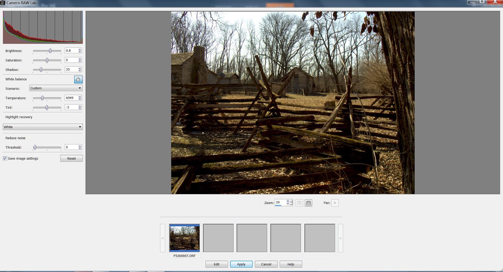
ACDSee Pro 7 Sharpening Controls


As stated earlier in this article, the sharpening controls between the "Develop" and "Edit" tabs are essentially the same. So I have arbitrarily decided to use the sharpening controls in the "Develop" tab as a point of reference. Above, is a screen print of the ACDSee Pro 7 sharpening controls in the "Develop" tab, with them resting at their default values.

The Amount Control

The ”Amount” slider controls works in conjunction with the other control settings. However even with the other controls at the default settings, there is still some change as the slider is moved, since the default settings are just that, settings.

The amount of sharpening change occurs by adjusting the amount of contrast around the edges of objects in a given photo. When the slider is “zeroed out” (all the way to the left) no sharpening change occurs and the more you move the slider to the right, the more sharpening changes occur.

How to get comfortable with this control:

  1. Select a photo with faces, leaves (grass or tree leaves are good), and possibly with some big text such as signs.
  2. “Zero out” all the sharpening controls. In ACDSee Pro 7, you can do this by placing the cursor on a slider control, and right clicking the mouse button. This will place that control in either the “Zero”, or absolute minimum effect position. On some controls that will be all the way to the left, on at least one control, it will be in the middle.
  3. Without setting the Radius or Detail controls, move the slider to the right, notice the level of sharpening that occurs. This is the level of sharpening that can occur with the other controls “zeroed out”.
  4. Now set the Radius and Detail controls to taste, and then move the Amount control. Note that the quality of the sharpening change that occurs is different. This control is very much dependent on the parameters set, or not set, in the other controls.
The Radius Control

To successfully use the Radius control, you must first decide if the detail in the photo is fine, coarse, or somewhere in between. This decision will affect how you want to set the Radius control.

The Radius control specifies the number of pixels to adjust around the edges of each object. Higher values will work best for coarser detail while the lower values work best for the fine detail. By setting this control first, you won't actually see any change to the photo as you set this control since you aren't making any changes, merely setting one of the parameters for when you ultimately will move the “amount” slider control.

The Radius control for sharpening is a slider bar with a scale increment varying from 1 to 20. Unfortunately, the ACDSee Pro 7 documentation doesn't appear to state with certainty that the increment numbers enumerate the number of pixels from the edge that are affected, though my experiments with this control tell me it is reasonably close to the absolute number of pixels affected. I believe from a day to day, operational point of view, it is safe to interpret the values as the number of pixels deep into the edge that the change will affect.

How to get comfortable with this control:
  1. Select a photo with faces, leaves (grass or tree leaves are good), and possibly with some big text such as signs.
  2. “Zero out” all the sharpening controls. In ACDSee Pro 7, you can do this by placing the cursor on a slider control, and right clicking the mouse button. This will place that control in either the “Zero”, or absolute minimum effect position. On some controls that will be all the way to the left, on at least one control, it will be in the middle.
  3. Set the Radius slider control all the way to 20. and then move the Amount Control slider to the right. You will notice that the faces and the leaves start to develop a many pixels deep border (called a “halo” by ACDSee) as you move the amount slider to the left, yet coarse detail like the big letters in the signage seem unaffected. This is because the faces and the leaves are often considered fine detail and fine detail is more susceptible to the “halo” effect.
  4. Now, move the Radius slider to between a “2” and “5”, and then repeat moving the amount slider, You will likely notice that the “halo” border that develops on the faces and leaves is almost non existent. It may even refuse to develop at all; yet there is a subtle, but real, overall sharpening effect that you can see, while the sharpening on the signs is VERY minor. If that border halo develops around the fine detail, move the radius slider control closer to “1” till it disappears. There will still be some level of sharpening as you subsequently move the Amount slider control.
Clearly the Radius control is subtle, but very important, in terms of creating the illusion of sharpness. But it is important to remember, that the edges this control “sees” aren't always the edges you think of as important. This control affects the whole of the photo, what I call the “logical” edges including noise and texture, and not those edges a reasonable person might see as important, those I call the “rational” edges.

The Masking Control

The Masking control targets the edges of objects while ignoring the sharpening of noise and texture, which can occur with the other controls. This control attempts to emulate the sharpening masks that can be created in typical mid level editors and above. Is it as effective as a bit mapped sharpening mask? I think so. Certainly, it is much more convenient, and it does have certain advantages over an editor based sharpening mask.

First of all, it can be done in both the ”Develop” and ”Edit” tabs of ACDSee Pro 7. Since the ”Develop” tab of ACDSee Pro 7 is non destructive ”editing”, that means, if you don't like what you have told it to do, it is easy to reverse what you have done. And in either the ”Develop” or ”Edit” tab, it doesn't require the use of layers. If you are new enough to bit mapped editing that you are uncomfortable with layers, this offers a pretty good alternative.

I also like the easy control this tool provides over edge sharpness. At lower settings, this tool looks for edges within the body of objects, but as you move the slider more to the right, the relatively minor interior edges are ignored and greater emphasis is placed on the more delineated object edges.

You need to be careful to find the right balance for this. I've discovered that a slight halo begins to appear around object edges as the slider is moved to the right. In this situation, the object edges do become sharper, but that halo slightly offsets the greater sharpness the tool provides. At normal viewing magnifications, or normal viewing distances for printed material, this halo isn't too noticeable, but if you magnify the image beyond what is considered normal, or if you expect viewers to get “up close” to a print, you will want to make sure that halo is at its minimum.

I've found that for foliage, and small detail objects, along with people (especially bare heads and skin) a low to medium masking value is useful. For those more coarse details, a higher masking value will work well.

In ACDSee Pro 7, if you just slide the slider to the right you won't see any change or accommodation to the photo at all. To see the edge delineation level, you need to press the “Alt” key as you move the slider to the right. Doing this, you will quickly see how the tool identifies the various edges found within the photo.

How to get comfortable with this control:

  1. Select a photo with faces, leaves (grass or tree leaves are good), and possibly some big text such as signs.
  2. Set your Radius, amount, detail, and threshold according to taste.
  3. “Zero Out” the Masking slider. In ACDSee Pro 7, this will be at level “0”.
  4. Move the slider gradually to the right, while pressing the “Alt” key. Note that at “0”, the image is completely whitened out. As the slider moves to the right, the interior edges of objects start to appear in black. As the slider moves further to the right, the object edges gradually start to appear in white, and the interior edges grow together in black. This is a visual representation of the sharpness masking layer found in bit mapped editors.
The Detail Control

I'm not all that comfortable with the Detail control description in the ACDSee Pro 7 help file. It may be accurate from a technical perspective, but it doesn't really give us any help in figuring out how to use it and I don't think it is complete in its description. (Look it up if you're curious. Getting comfortable with the help file is a GOOD thing!).

Instead, I like to think of it as providing us the ability to fine tune the effect of the combination of the Radius and Amount controls. It allows us to shift emphasis from fine to coarse within the spectrum already delimited by Radius and Amount, and it can reduce the size of the halo generated by the combination of the settings in the Radius and Amount controls. Moving the Detail slider to the right shifts sharpening emphasis to fine detail while shifting to the left emphasizes the coarser elements.

How to get comfortable with this control:
  1. Select a photo with faces, leaves (grass or tree leaves are good), and possibly with some big text such as signs.
  2. Set your Radius and Amount according to taste.
  3. “Zero Out” the Detail slider. In ACDSee Pro 7, this will be at level “50”, with an equal amount to the right in the slider as there is to the left.
  4. Zoom into a key area (from a sharpening perspective) of the photo. Depending on the photo, the zoom ratio could be as much as 200% - 300%. The goal is to see clearly the edges of the objects and those transition areas that define the edges.
  5. Move the slider to the left. Note that the image gets a tiny bit softer as does any halo that might still be there. Then move the slider to the right, note that sharpness goes up and the halo gets a bit more defined.
If you are happy with the level of sharpness and the halo generated by just using Radius and amount, there is no need to use the “Detail” Slider. Just leave it at the default setting of “50” for ACDSee Pro 7 (other software may use a different value scale, but you get the idea, I hope.)

Also, remember that the amount of change this control can make varies with the level of overall sharpening defined by the combination of the Radius control and the Amount control. This control is highly dependent on the other sharpening controls.

It is also good to remember that like the “Radius” control, the edges this control “sees” aren't always the edges you think of as important. This control affects the whole of the photo including noise and texture, what I call the “logical” edges, and not those edges a reasonable person might see as important, those I call the “rational” edges.

Threshold Control

Threshold controls the level of difference in pixel brightness within an object's edge must be before sharpening can occur.

So, sharpening can occur only if two adjacent (or physically close) pixels are different enough to overcome the threshold level you set. The higher values tend to sharpen strongly delineated edges and tend to ignore background noise. Lower values tend to sharpen both the edges of objects and the logical edges in their interior. As a result, at lower levels, noise also tends to get sharpened. I think the Threshold control could be reasonably described as a very mild Masking control.

ACDSee recommends that you set the threshold high enough to enhance the edges while minimizing the background noise. My experience indicates this is essentially correct. I think one gets better and more distinctive control over edge sharpening with the Masking control, however. But this tool is quite effective in adding just a mild boost to sharpness without excessively affecting noise.

The further to the LEFT the control slider resides, the more change that moving the Amount control to the RIGHT will display in terms of sharpness though at the cost of increased noise.

This control isn't really designed, however, to register large changes in sharpening. It seems its real function is to help you find a balance between noise and sharpness without excessive softening. If I need more edge sharpening, I use the Masking control.

How to get comfortable with this control:

  1. Select a photo with faces, leaves (grass or tree leaves are good), and possibly some big text such as signs.
  2. Set your Radius and amount according to taste.
  3. “Zero Out” the Threshold slider. In ACDSee Pro 7, this will be at level “0”.
  4. Zoom into a key area (from a sharpening perspective) of the photo. Depending on the photo, the zoom ratio could be as much as 200% - 300%. The goal is to see clearly the edges of the objects and those transition areas that define the edges.
  5. Move the slider gradually to the right, note that edge sharpness goes up very slightly and a very slight “creaminess” starts to appear in the interior of the objects.

Suggested Base Level Sharpening Workflow


  1. Set your base level exposure, white balance, and color controls. Don't concern yourself with cropping, or black and white conversion if that is your goal. At this point we are interested in developing a good, well exposed and color corrected photo with which to work.
  2. Decide if you are going to use the Develop tab or the Edit tab in ACDSee Pro 7. If you don't know, or don't have a strong reason to do otherwise, I recommend that you use the Develop tab for this step.
  3. Decide if the photo requires a fine detail strategy or a coarse detail strategy. In my experience, a coarse detail strategy is relatively rare.
  4. Set your Radius control. If you feel the need to go higher than, say, 4 on the radius scale, know that you are starting to pursue a medium coarse sharpening strategy and you might find detail in grass and leaves or hair to be less than you might want. I would suggest a “2” as a starting point for Radius.
  5. Set the Amount control according to taste.
  6. Set the Detail control. Remember, this sort of fine tunes the combination of Radius and Amount. If you already like the sharpness neighborhood that Radius and Amount put you in, you don't need to use this control. But it's there if you need it.
  7. Set the Threshold to whatever standard you are comfortable with. I use an “8” in ACDSee as a default, and if it seems inadequate, I adjust to taste.
Now examine your photo. Is it sharp enough overall? Remember, this is for the overall sharpness, ignore those areas that need specific sharpness changes if you suspect getting them “right” will ruin the overall sharpness of the photo. Remember that you can always address those specific areas in your Detailed sharpening step.

Ask yourself, "Will adjusting one of the above mentioned controls make things better, or, are you reasonably certain that they are set properly?" If you are reasonably certain that the prior controls are reasonably well set, then you might want to move on to the Masking control or you may decide to fix the issues you see in the Detailed sharpening phase.

After that, we are free to address other issues such as additional noise control, B&W conversion, special effects, etc.

There you have it. This is pretty much how I sharpen my photos. I'm pretty happy with the sharpening I now get from my images and I am now going back and redoing a large number of “old” photos that I no longer consider sharp enough.

Wednesday, April 2, 2014

On Using PSP X6 for Raw Conversions

Why should you use PSP X6's Camera Raw Lab (CRL) raw development component, when you already have a raw developer you like? The simple answer is, you shouldn't. You need to use the tools that work for you and allows you to produce the sort of photography you want to produce.

However, if you are using PSP as a companion editor for your favorite raw developer, you already know there are some tools that either won't work with raw images from anything other than PSP X6, or simply work better with images developed by PSP. (I'm thinking of the HDR tools, in particular) So there may be times when knowing how to get the best raw conversion from this tool will work to your advantage.


In spite of PSP X6's reputation for being weak as a raw developer, I have found that it is possible to get very good raw conversions from CRL, but only if you know what you are doing and are willing to accept the limitations built into the software. That sort of sounds like every other raw developer I've ever encountered!

With Corel PSP X6, you can do pretty much anything you can do with Lightroom or ACDSee Pro 7. However, it does it in a slightly different manner. And this has resulted in the erroneous belief that the Camera Raw Lab (CRL) component of PSP X6 is somehow 'not as good' as Lightroom or the other raw developers that practice "non destructive" editing.

CRL is as non destructive as any other raw developer. However, it limits itself to creating the best exposed image possible for the goals you have set for that image. Other edits in PSP are "destructive" in nature and require that you go into the editor for modification where you have an almost unlimited set of tools with which to work.

Is this less convenient than some of the tools found in the best of the Workflow software? Without a doubt. But it does have two advantages that might be important to you.

If you look at the training material for various plug-ins and third party tools, they pretty much all assume you are working with them as plug-ins in either Photoshop, PSP, or Serif PhotoPlus. (I use the Topaz family of plug-ins as an example)  And the workflow suggestions for such titles as Topaz DeNoise, for example, tell you to do the noise control portion right after you set your exposure.

However, the plug-in workaround for Lightroom, and any other workflow tool has a less than adequate flow of work. The Plug-in tools that claim to work with workflow software do this by functioning as a stand-alone editor that can only work on tif or jpg files.

What this means is that you have to make the choice of either creating a tif or jpg file right after you set the exposure and give up the non destructive capabilities of your workflow tools; or, create the best image you can in your workflow tool, and only then create a tif or jpg file to do your sharpening and noise reduction. This is the exact scenario that Topaz tells you NOT to do for best results!

From my experience, noise reduction and setting sharpness with Topaz DeNoise 5 and Detail 3 is better if done right after setting exposure than it is by waiting until I have 'tweaked' every portion of the photo I can, and only then, creating the fixed tif file for the stand alone versions of the Topaz tools.

The OTHER advantage of performing your raw development with PSP X6 is that with its raw methodology, the level of "interactivity" between the Plug-in tools and the rest of your editing is much higher.

An Example Using PSP X6:


  • You develop your exposure settings with CRL and send the image to the PSP X6 editor. 
  • You immediately set your sharpness and Noise reduction with your Topaz Plug-in tools. 
  • You crop, adjust color, perform selective sharpening, and any other edits you feel is appropriate 
  • You notice that the subsequent editing has altered the appearance of noise and sharpness, and it requires further tweaking. 
  • You invoke again your Topaz plug-in tools,and tweak the sharpness and noise control. 
  • If THAT changes the effect of any other setting you can tweak that setting as you feel appropriate. 
  • You create your first jpg or tif file for that image. 
An example using the typical raw developer set up to accept your favorite plug-ins as an external editor:
  • You develop your exposure settings with your favorite raw developer 
  • You either adjust the sharpness (and possible noise reduction) with the built in raw developer tools. 
  • You crop, adjust color, perform selective sharpening, and any other edits you feel is appropriate. 
  • You create a tif file (or jpg if you prefer) and send it to the Topaz plug-in tools functioning as a standalone editor. 
  • You immediately set your sharpness and Noise reduction with those tools. 
  • If tweaking of other edits is required, then you need to exit Topaz, return control to the raw developer, and either edit the tif altered by Topaz or the original raw image and start the 'non destructive' editing cycle all over again. 
Is this a major issue? Is this enough to get you to switch from your favorite raw developer to PSP X6? For some of us, it might be, for the rest of us, not so much.

The obvious question is, do I use the software this way? And the answer is, I do not. For most of my photos, most of the time, I’m willing to make a compromise with accuracy and image quality in order to improve the speed and quality of my workflow. But on the other hand, if I run into a situation that requires The use of third party plug-ins (such as noise reduction), I think I have one more tool available to me that many other people do not.

I'm willing to bet, however, that many of us have never even considered the effect of third party plug-in tools to our overall workflow. I personally don't care how you set up your workflow, you have to do whatever works for you. 

I would though, like you to have enough information to make an intelligent choice on when to use CRL. That way, it will be there for when you need it and you will be able to use it effectively when you need to.

Using PSP X6’s Camera Raw Lab


The Controls


The Histogram

  • The left portion of the histogram describes graphically how much of the photo is in the shadows. 
  • The right portion of the histogram describes graphically how much of the photo is in the highlights. 
  • The center portion of the histogram describes graphically how much of the photo lies within the mid tones. 
There are 3 colors in a photo that combine to make up all the other colors. These primary colors are Red, Green, and Blue. Note that there are 3 separate curves each representing one of these 3 colors. These curves are called the color channels.

The graph in the Histogram Adjustment dialog box displays the number of pixels for each value of the selected color channel. The vertical axis represents the number of pixels and ranges from zero to the highest number of pixels for each channel in the graph. The horizontal axis represents the value of the selected channel, from 0 to 255. Note that as the controls change, the histogram changes as well. This allows you to better understand the complex relationship between light and dark without letting the emotional, artistic content misdirect your attention.

The Exposure Controls

Brightness

The Brightness slider control is not difficult to understand. The image gets darker when you slide the control to the left, and gets brighter when you slide the control to the right.

However, watch the live histogram control as you slide the brightness control about. As you slide the control to the left, the curves become a little bit taller, skinnier, and more compressed to the left. When you slide the control to the right, the curves become a tiny bit shorter, a bit more spread out, and seem to drift to the right.


While each photo is different, certain things remain generally true. As the shadows become more prominent a larger number of pixels are contributing to the number of pixels sitting on the left, and fewer pixels contribute to the highlights as they are pushed to the area representing the mid-range tones. And some of the mid-range tones are pushed into the shadows. Because it is relatively easy to darken a pixel, it is relatively easy to squeeze a lot of the pixels in your photo closer to the left edge of the histogram.

As the highlights become more prominent, pixels contributing to the lightest shadows start to drift to the center of the histogram, while the lightest mid-tones and highlights are pushed closer to the right edge of the histogram. Because there are usually fewer highlights in many photos the darkest shadows tend to anchor the left edge of the curve and as a result, when brightening, the curve tends to stretch its way to the right rather than moving everything to the edge the way the darkening does.

Saturation

This control is similar to brightness but deals with color purity, instead. When you slide the saturation control to the left, the colors seem to go away, when you slide the control to the right, the colors becomes deeper. In a photo there are 3 colors that combine to make all the other colors. Red, Green, and Blue. If there are a lot of pixels in a given primary color, the curve for that color channel will be tall in the histogram. Each color channel has a value from 0 to 255.

A value of zero means the all the color for a given color color channel has been reduced to nothing, so the histogram curve for that color gets skinnier. When set to zero, the curve doesn't go away because the pixels set to zero are still designated as belonging to one of the 3 primary colors. they just happen to be set to zero. So while you will see a skinnier histogram curve for that color, you won’t see it go away completely.

A value of 255 for a given color means that as much of that color has been added as possible, and the curve for that color gets fatter.

Changing the saturation value of a primary color won’t change the number of pixels assigned to a given color, it will just change the level of saturation, so the height of the histogram curves remain the same while the width of the curve changes.

Time for a little experiment! Go back and change the brightness slider again! Notice how the height of the color curves change. Can you figure out why? Well the brightness control changes the luminance of the pixels. By brightening or darkening those pixels we drive some of them into the odd behavior of not acting like a primary color, just one of lightness and darkness. Fortunately the raw infrastructure is keeping track of what color they are supposed to be, so we can add the color back if we had to.

Shadow

Do not make the mistake of thinking that the Shadow control is a poorly named 'contrast' control, it is not. Instead, what it does is, by sliding the Shadow control to the right, you darken the shadows. Then gradually, you begin to darken the mid tones as the control slides further to the right. But note that at no time, does the shadow control seem to affect the highlights. A true contrast control would attempt to accentuate the differences between all the various shades of highlights, rather than just one end.

Now this can often serve to create a bit of an illusion that contrast has increased, but the ability to ignore the highlights adds an interesting twist to the usual grouping of the Brightness, Saturation, & Contrast controls found in many exposure panels.

If you want to actually control the contrast you can, but not at this point. This is a true exposure control aimed at the shadows. It allows you to set the Exposure value (EV) for the shadows independently of the overall EV set by the brightness control.

White Balance

As the name implies this control adjusts how colors are set to control how white would display in the photo. In other words, would the white object appear as a pure white, or would they be shaded in someway towards another color? Any more, white balance is controlled so well by the camera so that whites almost always appear white. But sometimes they make a mistake, or we want a special effect. So it helps to understand what the white balance is doing.

The Eye Dropper control

This is one of the little mysteries of PSP's Camera Raw lab. Just WHAT does this thing do? The help file doesn't even mention it. After some experimentation, I have a pretty reasonable guess. If you select either a White, Black, or Gray pixel with the eyedropper, you can adjust the White balance by removing any tint, or color shading, from that pixel by adjusting the color balance of the entire photo.

While this kinda, sorta works, I just don't see how this is superior to setting one of the White balance presets in the Scenario control and then adjusting the sliders to taste. Though in all honesty, Most cameras do a pretty good job of setting the white balance automatically.

Highlight Recovery

Highlight Recovery is a tool of presets that control how highlights are to be presented. There are 5 settings, they are:
  1. None 
  2. Normal 
  3. White 
  4. Balanced 
  5. Color 
If you look at the live histogram and the other controls as you select the various options, you will notice that the histogram takes a slightly different configuration with each selection, even though the Exposure controls and the White balance controls don't change.

What appears to be happening, is that each preset darkens just the highlights according to a preset standard set by Corel. But each preset seems to consider different levels of brightness as the desired minimum level. So while the saturation and other exposure values, along with the white balance values don't change, the histogram shifts a bit to accommodate the change in highlight values. This, of course, changes the look and feel of the photo overall.

Reduce Noise

Even though the slider control in the "Reduce Noise" section is actually labeled "Threshold", I don't believe this is a true, traditional, threshold control.

The term, "Threshold" implies that the difference in luminance (or some other quality) between two closely placed pixels must be greater than the threshold level set before any action can be taken on them.  This does not appear to be happening in this case.

Instead this appears to be a simple noise control that merely progressively smears the image the more you slide the control to the right.

This is clearly the weakest control in CRL. I suggest that you leave this control set to zero, and either wait to perform your noise control in PSP's bit mapped editor, or use a third party noise control plug-in once you get to the editor. 

I see no value in this control what so ever. Corel should either bring it up to the standard set by noise control found in other software, or drop it completely. Beginners will just smear their work beyond all repair otherwise.

I suspect this control is the cause of much of PSP's reputation for not being a good raw developer.

Image Selection Strip

At the bottom of the CRL window is a section where strip of images will allow you to work on several images in a sequential manner, but allows you to flip back and forth between images so you can create a similar look and feel among the images.

To use this control, you don't need to be using the PSP X6 "Manage" Tab (the built-in organizer/browser). You can select the images the images in any browser (that I know of!) that can invoke an external editor and select PSP X6 as your editor. I tested this with ACDSee Pro.

All of the photos will be sent to CRL and reside in the image strip. You can make the changes sequentially for each photo and make sure they all look the way you want.

The "Apply" button will apply the changes to the images, and send control back to your organizer.

The "Edit" button send the all images, with changes, to the PSP X6 editor at the same time. You need to show some restraint, however, since image files straight from the camera, are getting larger and larger. And it will be relatively easy to send too many photos to the editor at the same time and cause resource problems not only with PSP X6, but your computer as well. Your resources are FINITE, so a little common sense might be required here!


In Summary

This is a pretty good tool once you take some time to understand how it works and how it is designed to fit into your workflow. It is good enough for a beginner with raw to get started inexpensively and still turn out good work. 

 And for the rest of us, it is one more tool to be used from time to time when appropriate. It is not something to be avoided or dis-respected. It does what it was designed to do very well.