This is part 2 of the series I originally promised when I published "The Historgram".
Eventually, I will walk you (and myself, this has been an incredible learning experience for ME as well!) through the entire ACDSee Pro 7 set of controls. I will do the Development tab first and after that, I will do the same thing with the Edit tab and the management tab. I have not yet determined the exact order of completion for those two modules.
Also, be on the look out for video tutorial versions of these articles. I'm not sure WHEN those will get completed. I've got a LOT to learn about scripting, recording and editing tutorial videos. I don't want to produce junk.
As far as users of other software besides, ACDSee Pro are concerned. This information is pretty much usable by you. The controls may differ a bit, but the principles remain the same. I should think this information will be useful for you. This information is pretty universal.
The General Controls - Getting The Basics Right.
 The General controls are those controls that I think of as the "traditional" raw development tools. They are found in almost every raw development program around. Getting THESE controls set properly is the whole point of raw development. If you can't can't get these controls set properly, then you might as well shoot jpg only.
The other tools we see in the Development tab are useful to be sure. But all they really do is allow you to do the equivalent of bit mapped editing before you convert to a tif or jpg file. convenient, to be sure. But not essential to good raw development. I will explain them in the order in which they appear on the Develop module screen.
Color and Black and White Sub Tabs - These tabbed controls don’t really do all that much other than desaturate or re-saturate the image with whatever color controls were current at the time the B&W tab was activated. See my Tutorial on B&W conversions, HERE.
HINT: Curiously though, I have found this tab useful for luminance noise control. When you are ready for simple noise control, use the B&W tab to convert to B&W, then go to the Noise reduction control and adjust your Luminance. I’ve found the luminance noise is much easier to identify and address without the color information being there. Then when I’m satisfied with the noise reduction in Luminance, I go back to the Color and Black and White sub tabs and select color, allowing the image to be resaturated to the settings I had previously. At that point, I can go back to Noise reduction and address color noise (or use a third party NR tool).
Exposure - We all understand this control brightens and darkens a photo, but what this slider control actually does is allow you to adjust exposure to as much as an EV of -2 of under exposure, to an EV of +2 on an over exposure. The value settings on this control appear to be a 1:1 comparison of the EV numbers, though ACDSee never says that directly. In my tests, sliding the control to the left to a - .5 corresponds to setting an EV of -5 on the camera that the difference is irrelevant in my eyes.
Two points you need to remember regarding the exposure control.
- If you need more than an EV spread of, say, -3 to a +3, then your ability to set your camera accurately for your desired effect must be questioned. If you are THAT far off on your exposure, you have either done something wrong, or your camera is broken. Or you need to consider HDR!
- If you find yourself setting this control consistently to, say, an EV of -.5 (or whatever value), then maybe you should consider adjusting your camera to always underexpose to a value of -.5. Getting it right at capture time is always better than adjusting it later.
Yes, we all understand that it makes the photo brighter, but what does Exposure actually DO to the photo? Take the photos you are working with and slide the Exposure control to the right, note that everything the curve represents slides to the right, and what appears to be the left most anchor point for the start of the shadows also moves to the right. If you move the slider to the left, everything moves to the left, including the shadow anchor point.
Highlight Enhancement - This control is somewhat misunderstood. What it does, is darken the highlights while ignoring the mid-tones and shadows. It allows you to set the exposure control properly for the shadows and mid-tones and then selectively darken the highlights only so that you don’t lose the detail in them.
Try a little experiment. Take a photo that you want to work with, and move the EXPOSURE control a bit too far to the right. If you like, toggle the clipping view to "on". (That little triangle icon just above the Histogram and below the word “Tune”)
Notice how the brightest highlights start to go completely white. Also take note of the Histogram. Note how the curves are flattened and sort of pushed to the right.
The part of the curves that represent shadow (the left side) in the histogram remain anchored in about the same place on the left, but the part of the curve representing the shadows and mid-tones get a bit shorter and squeezed to the right.
Also note how the highlight portion of the curve not only is pushed too far to the right, but that portion of the curve gets skinnier and taller.
What you are seeing is ACDSee trying to brighten the shadows and mid-tones by pushing them to the right of the histogram, Naturally, since we are using the overall exposure control this forces the highlights to an ever brighter position. Leave the Exposure control at the ‘too far to the right’ position you have selected.
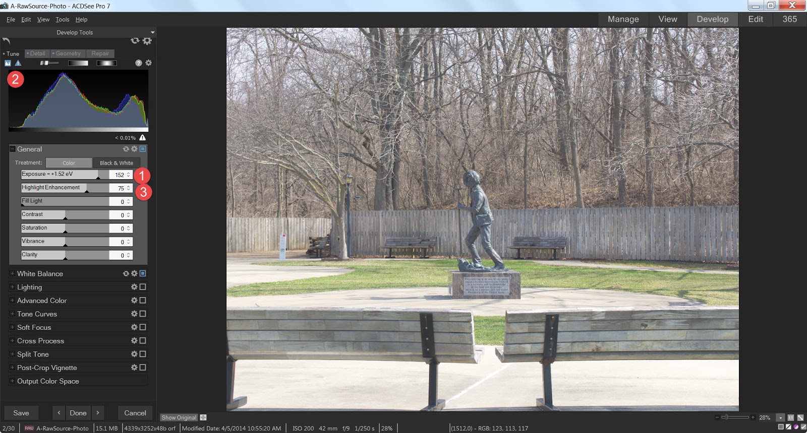 Now, let’s look at the Highlight Enhancement control. By sliding that control to the right, the highlights start to darken a bit, though the shadows and mid-tones don’t change all that much in the photo itself. But look what happens in the histogram. Notice that the portion of the curve on the far right starts to get shorter and fatter as it moves back to the left. But curiously, while the shadow and mid-tones portion of the curve do get taller because some of the highlights are being forced back to the left so there are more mid tones. and the ‘anchor point’ on the left where the shadow portion of the curve starts to take shape doesn’t move at all, the "lighter" shadows and mid tones don't really slide to the left to any significant degree.
So, what we have demonstrated is that Highlight Enhancement tries to shift the Histogram BACK to the left without adjusting the left most anchor point, and the net effect is that the shadows and mid-tones are affected less by this adjustment than are the highlights.
Fill Light Control - Oddly, this control is very similar to the exposure control, BUT what it does is respect the shadow anchor point as set by the exposure control. So in other words, the leftmost anchor point as set by the exposure control never changes as you slide the Fill light
control to the right, everything else is pushed to the right. (Everything EXCEPT the shadows get brighter)
Contrast Control - This is an interesting control from a Histogram perspective. What it does when you slide the control to the right (i.e. increase contrast) is squeeze the middle portions of the curve down and push the extreme left and right sections of the curve to their respective edges of the histogram. In other words, it decreases the intensity of the mid-tones and increases the intensity of the shadows and highlights.
When you slide the control to the right (i.e. Decrease contrast), what occurs is that the intensity of the shadows and highlights decreases and the intensity of the mid-tones increases.
Saturation Control - This control is similar to brightness but deals with color purity, instead. When you slide the control to the left, the color seems to go away, when you slide the control to the right, the color becomes deeper. In a photo there are 3 colors that combine to make all the other colors. Red, Green, and Blue. if there are a lot of pixels in a given primary color, that curve will be tall. Each color has a value from -100 to +100 with the default of zero (0) .
A value of +100 for a given color means that as much of that color has been added as possible, and the curve for that color gets fatter.
A value of -100 means the all the color for a given color has been reduced to nothing, so the color channel curves start to merge with the overall luminance curve set by the exposure control. As a result, the photo now appears to be black and white.
When set to -100, the curve doesn’t go away, because the pixels set to zero are still designated as belonging to one of the 3 primary colors. they just happen to be set to -100 and all that remains is the relative luminance.
Changing the saturation value of a primary color won’t change the number of pixels assigned to a given color, it will just change the level of saturation, so the height and width of each color channel moves closer or further away from the curve representing Luminance.
Vibrance Control - The ACDSee Pro help file claims that Vibrance adjusts the intensity of the colors in the same way as saturation, but that skin tones are less affected. The text doesn't really mention other already lightly saturated objects though many people have always assumed it worked equally well on any lightly saturated object.
It does seem to protect skin better than non skin objects in a photo, but I'm not sure if that is not some sort of illusion. Logic tells me it should work equally for any lightly saturated object, but I just don't know for sure, since the difference is most noticeable for protecting skin when increasing saturation overall.
Vibrancy does seem to work LESS, on less saturated colors, but oddly, the effect is much less noticeable when moving the slider to the left (DE-saturating) than it is moving the slider to the right (adding saturation). Its effect is SO much less noticeable when de-saturating that it fooled me into thinking it wasn't working. If I were to want to de-saturate more than just a VERY tiny bit and still prevent significant change to skin tones, I might consider using a development brush to protect the skin tones completely. See the article on using development Brushes here.
I tested the Vibrance control on a series of photos where the range of skin tones was very wide, from the palest 'white', to the darkest 'black', and everything in between. Apparently, even the darkest skin isn't all that saturated overall, because I felt Vibrance protected very dark skin about as well as the lightest skin. But again, when de-saturating the protection effect was minimal.
The effects of the Vibrance control is VERY subtle. You will want to be very careful and selective in its use.
Clarity Control - This is both a useful tool and an incredibly sweet confection! What Clarity does is add or remove contrast to the mid-tones only, leaving the highlights and shadows alone.
Many people think of it as a sharpening control. I know this because when I was writing about sharpening earlier (Here), LOTS of people wrote me asking why I didn't include Clarity in the discussion.
True, Clarity can increase the illusion of sharpness, but so can contrast in general. In fact Sharpening is really no more than the technique of adding contrast to the edges of the objects. So why ISN’T clarity considered a sharpening tool instead of a general or exposure tool? Primarily, in my eyes, that is because it simply doesn’t care about the edges of objects. It will increase or decrease contrast to every mid tone it sees, edge or not.
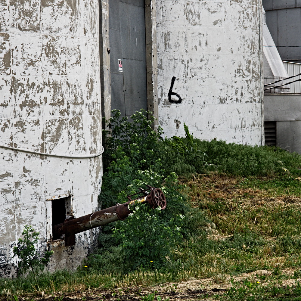
Let’s take another look at our sample photo and its histogram:

Note how there aren’t a lot of highlights or shadows in the photo. It is mostly mid tones. Now look at the histogram, almost nothing of the curves actually reach the extreme left or right of the chart. The area of the most shadow is roughly 20% closer to the right edge of the chart than the left. And it seems the highlights don’t really even make it to the right edge! They stop about 80% of the way from the left edge to the right. I would say, that for the most part, this is a photo with very little washed out highlights or solid blacks. Just about everything resides in the mid tones area.
Just for fun, try a little experiment. With your favorite photo, invoke the clipping view (That little triangle icon just above the Histogram and below the word “Tune”) and slide the Clarity tool all the way to the right. Notice you won’t see much clipping, if any. (In my sample photo I don’t see any.), Now reset the Clarity slider and move the Contrast slider all the way to the right.
There’s a huge difference, isn't there? What is happening is that by concentrating on just the mid-tones, very little of those mid-tones are forced into either the highlights or shadows. And THAT is what makes Clarity such an important and useful tool. We can either add or remove contrast in just those tones that carry most of the photo's useful information.
Summary
That is it! Adjusting exposure in Post Processing is really nothing more than manipulation of the histogram and understanding how the various controls affect the histogram can really help you understand what it is you are doing to the photo when you start moving sliders around. You don't have to pay EXCLUSIVE attention to the histogram, you need to look at how the photo "Looks" as well. But you really need to understand what is going on, it helps when you just can't seem to get the exact look you want.

 See my previous post on a hint for noise control, HERE.