Wednesday, October 8, 2014
m43s Users in Central Illinois I want to hear from you!
We seem few in number and I'd like to know who you are! I'm thinking maybe a Google plus Circle or Flickr group might be useful. maybe we could plan group outings and activities. I can't believe I'm the only guy out here on the rolling prairie.
Saturday, September 27, 2014
How to Prevent ACDSeePro Commander 8 from Launching
One problem I have noticed with the new Windows version of ACDSee Pro 8, is that a program launcher has been added that runs continuously in the background and appears in the Windows taskbar.
That's not such a big deal if you LIKE continuously running launcher programs that load every time you run ACDSee, that you have no control over, and can't be terminated outside of the task manager. Personally I DON'T like that sort of thing and I don't understand why ACDSee doesn't give us the opportunity to prevent us from loading it in the first place.
I don't have a problem with launcher programs in theory, I just want to control when they get loaded or if they get loaded at all.
I can't believe this lack of user control was anything but an oversight that will eventually get fixed, but in the meantime, I've documented the steps to "fix" it from your end.

I have learned that by renaming ACDSeeProCommander8.exe file you can prevent it from loading at all with no apparent issues in running ACDSee Pro 8. Here is how to do it:
That's not such a big deal if you LIKE continuously running launcher programs that load every time you run ACDSee, that you have no control over, and can't be terminated outside of the task manager. Personally I DON'T like that sort of thing and I don't understand why ACDSee doesn't give us the opportunity to prevent us from loading it in the first place.
I don't have a problem with launcher programs in theory, I just want to control when they get loaded or if they get loaded at all.
I can't believe this lack of user control was anything but an oversight that will eventually get fixed, but in the meantime, I've documented the steps to "fix" it from your end.
I have learned that by renaming ACDSeeProCommander8.exe file you can prevent it from loading at all with no apparent issues in running ACDSee Pro 8. Here is how to do it:
- Launch Windows Explorer.
- Navigate to C:\Program Files\ACD Systems\ACDsee Pro\8.0 folder
- Scroll down till you fine ACDSeeCommanderPro8 (application) - See yellow arrow above.
- Right click that file and select rename from the pop up window and rename the file.
- press "Enter" and exit Windows explorer
BEFORE you do this renaming task, some advice: When I rename a file like this, I keep the name the same except for adding a "z-" in front of the name. That way it is easy to find and to know the exact original name of the file. Also adding a 'z-' to the front means that it will sort to the bottom of the file list if you sort by name. Also very convenient for finding a renamed file.
Also note the BLUE arrow pointing to the acdIDInTouch2 application. This file appears to control any communications between your PC and the ACDSee company. I have renamed it as well with ALMOST no negative effects to ACDSee Pro 8 (so far, as I write this it's only been out 1 day!).
With "inTouch" disabled, I was still able to upload a photo to Flickr, but I was not able to check to see if updates were available. It may, or may not, affect one's ability to interface with the ACDSee 365 online drive service. I don't subscribe to ACDSee 365, so I don't have a way to test that. Technically, this straddles the line as to whether or not this cripples ACDSee Pro 8. I personally am inclined to keep it as a functioning portion of ACDSee pro.
Even though "InTouch" runs in the background continuously, it doesn't really seem to slow my system down any. So I don't know if it is worth renaming or not. To my knowledge ACDSee hasn't had a history of abusing this privilege that you, as a user, grant them. So - no performance hit and no history of abuse tells me that the 'InTouch" program is not an issue for me. YMMV.
If I were asked by some bigwig from ACDSee why I would want to rename the Commander pro 8 application so it can't be loaded, I would say its use should be optional, it's just a loader, after all, and it adds no value to the ACDSee Pro user experience in my mind. And once it is loaded, I for sure, should be able to exit out of the thing WITHOUT having to resort to the Windows Task Manager. In my mind, in it's current form, it's a dumb nuisance app that won't win ACDSee any friends.
Sunday, September 7, 2014
The Truth About Lens Fungus
Below is an enhanced variation of a post I made on a photography forum site because I thought people were spreading misinformation and general “dumb statements” regarding lens fungus.
Originally written in haste, I decided to do some real research and back up my conventional wisdom and correct any stupid statements on my part (not that there would be any, LOL!)
I’m happy to say my original post isn't too far off from this revised version. However, I could not find current corroboration for everything. So if you've encountered THAT version before this version, feel assured that what I wrote there is 'essentially' true however I don’t think I explained some things properly.
“Lens Fungus” is usually defined as an infestation of fungal spores inside a lens assembly that are allowed to grow and reproduce. One of the byproducts of fungal growth is acid which can either etch lines into the lens or render a lens cloudy to the point that the image it projects is soft, or the lens is unable to project an image at all.
Lens fungus can only grow on glass elements that are coated with biological lens coatings. That sort of coatings aren't used that much any more (if at all). Note that I did find some belief that some of the "Rare Earth" type of glass could theoretically contain enough food to allow fungal growth on lenses. However, I suspect that modern manufacturing techniques would probably minimize any significant infestation of fungal spores inside the sealed lens assemblies in the first place.
Other biological contaminants can be used by fungus as food. It is important that other contaminants be kept to a minimum within a lens assembly. This would include dust, lint, oils, varnish, dirt and glue. However, it has been my experience that this stuff is rarely found inside a sealed lens element assembly, and the varnishes and glues used in modern manufacturing techniques tend to be inherently anti fungal in nature. I have seen some dust in some lenses, but in my experience, it doesn't seem to affect the optical quality or fungal growth in modern lenses (lenses, say, less than 20 years old).
And the fungus really can only grow in warm, humid environments anyway. One of the web pages I used as a reference is the Zeiss service info page on fungus on lenses. It claims a humid environment has a relative humidity of 70° and is between 10℃ and 35℃ (50℉-95℉) for three consecutive days. But that would mean most of North America and parts of Europe are a humid environment during the summer, and I simply don’t believe that part of the world generates much in the way of lens fungus. I suspect this is a case of a manufacturer being extra cautious. (But all in all, it’s a good reference page!)
The outside of the front and rear lens elements are so RARELY infected (because they are exposed to outside air of varying degrees of humidity) that it has never been considered much of an issue. Yes, they theoretically can be infected, but I haven't even HEARD of such an infection, much less seen one.
No lens is perfectly sealed, and over time, warm moist humid air seeps in and has difficulty in seeping out quickly enough to stabilize the environment to safe levels of humidity. That, coupled with biological lens coatings makes for an environment suitable for fungus.
Condensation can help with fungus growth, but it isn't a significant factor. The interior of a lens assembly is sealed well enough that the 'dead' air inside acts like an insulation barrier for the internal assembly. Humidity can seep in slowly, but the assembly is sealed well enough to prevent the rapid heating or cooling of internal components that cause condensation. The condensation on EXTERNAL components are irrelevant.
Fungus that grows inside a lens was put there at the time of lens assembly. The spores are too big to pass through the lens assembly seals. Fungus CAN NOT infect your camera body NOR can it pass from one lens to another. ALL older lenses are infected at the time of assembly NOT after assembly.
author’s note: I recall reading the stuff above about condensation and point of contamination years ago (either "Modern Photography" or "Popular Photography" magazines, I believe) , but I can not find any current corroboration. So incorporate this into your personal knowledgebase at your own risk.
Shine a flashlight into the lens, fungus will appear as soft, white dots scattered about the lens. Under magnification, they will appear to be even smaller clumps connected by delicate tendrils of fungal infection.
Zeiss (here) recommends special climate controlled cabinets heated to between 40℃ - 50℃ (104℉ - 122℉ ). But for the average amateur, that seems like an excessive expense.
I looked for some simple easy ways to help reduce the problem. I make no claims for the value of these suggestions, pleased be advised you alone are responsible for any damage you do to your lenses or other property!
Store the lenses next to silica gel packets, and recharge those packets regularly by heating to the temperatures recommended by their manufacturers.
UV light retards the growth of fungus. In humid climates aim the lens (off camera) at the sun or other uv light source for several hours each day, with the rear lens cap on. However I found two common caveats in my research.
EDIT 5/28/2015: I did hear from a reader that suggested that the rubberized focal-plane shutter curtain could probably host a fungal infection. which, now that I think about it, seems reasonable. I did some casual internet research on this and I didn't find any supporting information on this though. This may be the cause of a camera itself smelling 'funny'. Based on the results of my previous research on lenses, while there might be some increase in the fungal infection of lenses from the focal plane shutter, I suspect the actual incidence would be VERY small. If you have a camera which you suspect is infected in this way, I would suggest that you store the camera with the lens off and only attach it prior to a shoot.
Modern lenses are assembled in air conditioned and air filtered environments, infection is not likely and subsequent infection is so unlikely (non biological coatings, - on food for fungus, etc) that it just isn't a significant issue.
You don't want fungus on a lens, and don't buy a lens with it. But lens fungus is not the ebola virus it CAN'T spread in any significant way, it can pretty much only ruin ONE lens.
Originally written in haste, I decided to do some real research and back up my conventional wisdom and correct any stupid statements on my part (not that there would be any, LOL!)
I’m happy to say my original post isn't too far off from this revised version. However, I could not find current corroboration for everything. So if you've encountered THAT version before this version, feel assured that what I wrote there is 'essentially' true however I don’t think I explained some things properly.
What is lens fungus and why is it bad?
Lens fungus can only grow on glass elements that are coated with biological lens coatings. That sort of coatings aren't used that much any more (if at all). Note that I did find some belief that some of the "Rare Earth" type of glass could theoretically contain enough food to allow fungal growth on lenses. However, I suspect that modern manufacturing techniques would probably minimize any significant infestation of fungal spores inside the sealed lens assemblies in the first place.
Other biological contaminants can be used by fungus as food. It is important that other contaminants be kept to a minimum within a lens assembly. This would include dust, lint, oils, varnish, dirt and glue. However, it has been my experience that this stuff is rarely found inside a sealed lens element assembly, and the varnishes and glues used in modern manufacturing techniques tend to be inherently anti fungal in nature. I have seen some dust in some lenses, but in my experience, it doesn't seem to affect the optical quality or fungal growth in modern lenses (lenses, say, less than 20 years old).
And the fungus really can only grow in warm, humid environments anyway. One of the web pages I used as a reference is the Zeiss service info page on fungus on lenses. It claims a humid environment has a relative humidity of 70° and is between 10℃ and 35℃ (50℉-95℉) for three consecutive days. But that would mean most of North America and parts of Europe are a humid environment during the summer, and I simply don’t believe that part of the world generates much in the way of lens fungus. I suspect this is a case of a manufacturer being extra cautious. (But all in all, it’s a good reference page!)
The outside of the front and rear lens elements are so RARELY infected (because they are exposed to outside air of varying degrees of humidity) that it has never been considered much of an issue. Yes, they theoretically can be infected, but I haven't even HEARD of such an infection, much less seen one.
No lens is perfectly sealed, and over time, warm moist humid air seeps in and has difficulty in seeping out quickly enough to stabilize the environment to safe levels of humidity. That, coupled with biological lens coatings makes for an environment suitable for fungus.
Condensation can help with fungus growth, but it isn't a significant factor. The interior of a lens assembly is sealed well enough that the 'dead' air inside acts like an insulation barrier for the internal assembly. Humidity can seep in slowly, but the assembly is sealed well enough to prevent the rapid heating or cooling of internal components that cause condensation. The condensation on EXTERNAL components are irrelevant.
Fungus that grows inside a lens was put there at the time of lens assembly. The spores are too big to pass through the lens assembly seals. Fungus CAN NOT infect your camera body NOR can it pass from one lens to another. ALL older lenses are infected at the time of assembly NOT after assembly.
author’s note: I recall reading the stuff above about condensation and point of contamination years ago (either "Modern Photography" or "Popular Photography" magazines, I believe) , but I can not find any current corroboration. So incorporate this into your personal knowledgebase at your own risk.
How to tell if you have a Fungus infestation
Shine a flashlight into the lens, fungus will appear as soft, white dots scattered about the lens. Under magnification, they will appear to be even smaller clumps connected by delicate tendrils of fungal infection.
How to prevent and remove fungal infections.
Zeiss (here) recommends special climate controlled cabinets heated to between 40℃ - 50℃ (104℉ - 122℉ ). But for the average amateur, that seems like an excessive expense.
I looked for some simple easy ways to help reduce the problem. I make no claims for the value of these suggestions, pleased be advised you alone are responsible for any damage you do to your lenses or other property!
Store the lenses next to silica gel packets, and recharge those packets regularly by heating to the temperatures recommended by their manufacturers.
UV light retards the growth of fungus. In humid climates aim the lens (off camera) at the sun or other uv light source for several hours each day, with the rear lens cap on. However I found two common caveats in my research.
- Don’t aim the sun or other UV light source straight down the barrel of the lens, since theoretically the focal point might well fall on the rear lens cap and melt a hole through it. placing the lens at a slight angle seems to be to most common suggestion.
- Don’t use “blacklight” style lamps the level of UV rays generated by them are not strong enough to do any good.
Summary
Cameras can't really get infected since there is little inside a modern camera body that will feed fungus spores, allowing them to grow. The movement of lubricated mechanical parts (that still use biological lubrication - few parts like that, I reckon) would likely grind any fungus to bits before it became a problem.
EDIT 5/28/2015: I did hear from a reader that suggested that the rubberized focal-plane shutter curtain could probably host a fungal infection. which, now that I think about it, seems reasonable. I did some casual internet research on this and I didn't find any supporting information on this though. This may be the cause of a camera itself smelling 'funny'. Based on the results of my previous research on lenses, while there might be some increase in the fungal infection of lenses from the focal plane shutter, I suspect the actual incidence would be VERY small. If you have a camera which you suspect is infected in this way, I would suggest that you store the camera with the lens off and only attach it prior to a shoot.
Modern lenses are assembled in air conditioned and air filtered environments, infection is not likely and subsequent infection is so unlikely (non biological coatings, - on food for fungus, etc) that it just isn't a significant issue.
You don't want fungus on a lens, and don't buy a lens with it. But lens fungus is not the ebola virus it CAN'T spread in any significant way, it can pretty much only ruin ONE lens.
Wednesday, August 13, 2014
Distortion Correction In ACDSee Pro 8? It appears So - Sorta . . .
______
In the ACDSee Pro 8 help file topic, "Viewing Raw Images" I came across this statement, "ACDSee will automatically apply geometry corrections to DNG files that include geometric distortion correction tags. DNG files created from the Adobe DNG Converter© will often generate geometric distortion tags for micro 4/3rds cameras. "
If I am interpreting this correctly, then the Adobe DNG converter reads the distortion correction built into the raw files, and translates them into the DNG equivalent and stores them with the dng file. Then ACDSee Pro will read and apply those correction numbers to the image.
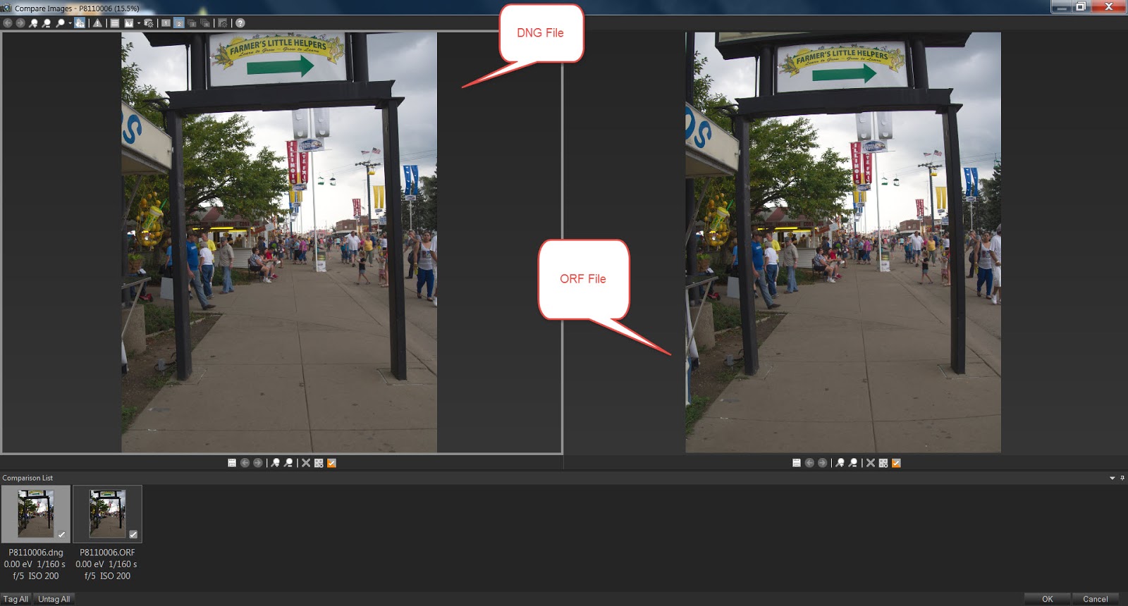
I decided to test this out. And whadayaknow, it works!
I shot a photo with my E-M10 and the kit lens, the OLYMPUS M.14-42mm F3.5-5.6 II R. I converted it with the Adobe DNG converter. and displayed both in ACDSee Pro 8. It works! See the screen capture below, it should be obvious.
These are unedited. I am going to go through my photos shot with other lenses to see if I can find any discrepancies.
My experience with the DNG converter was really very good compared to the earliest versions I tried years ago. It was no longer a command line app, and it offered a lot of useful options. It took about 3-4 minutes to convert 34 16 MB orf files.
I wonder if camera systems OTHER than m43s and who include distortion correction will work this way with DNG and ACDSee? I mean DNG would likely have any distortion tags in the same place regardless of the camera source, wouldn't it? Anyone care to try?
But this does bring up some questions:
- If ACDSee can read that info from DNG, why can't it read the data directly from the native raw files?
- It implies that this only works for m43s, why would a dng sourced from m43s be any different than one sourced from Sony or Nikon? (Don't get me wrong, I use m43s and I happy they are using m43s. But why m43s?).
I'll add more info when I get it, I guess!
Saturday, July 19, 2014
The Difference between Raster and Vector Layers.
One of the issues many new users have when trying to learn how to use the layer functions of PSP, is when should they use Raster layers, and when should they use Vector layers?
Actually, the answer is pretty easy and is found in the PSP help file.

Raster layers are for pixel level manipulation. That means this is probably the sort of layer you want to edit your photo with. And if you are trying to interpret a Photoshop tutorial so you can apply the information to PSP, this is probably the sort of layers system that particular tutorial is referring to.
Note that you can only draw pixel level changes on raster layers. If you attempt to draw a pixel level change on a Vector layer, PSP will create a new raster layer for that change. If you don't know that fact, it can be quite disorienting!
Vector layers are, for lack of a better term, object level manipulation. That does not mean you use it to edit that tree in the background of you photo. Instead, that is what you would use to add lines, shapes, patterns, and text to a photo.
Any object that has a unique set of properties (size, opacity, density, etc) is a vector object. Those unique properties remain constant regardless of what you do
Again, note that you can only draw vector level changes on vector layers. If you attempt to make a vector level change to a raster layer, PSP will create a new vector layer for that change.
A lot of competing editors sort of hide the whole vector layer issue from the user, by just calling it "add text" or something like that in order to avoid confusing the user from having to decide which sort of layer to select. Why doesn't PSP X6?
Actually, the answer is pretty easy and is found in the PSP help file.
Raster layers are for pixel level manipulation. That means this is probably the sort of layer you want to edit your photo with. And if you are trying to interpret a Photoshop tutorial so you can apply the information to PSP, this is probably the sort of layers system that particular tutorial is referring to.
Note that you can only draw pixel level changes on raster layers. If you attempt to draw a pixel level change on a Vector layer, PSP will create a new raster layer for that change. If you don't know that fact, it can be quite disorienting!
Vector layers are, for lack of a better term, object level manipulation. That does not mean you use it to edit that tree in the background of you photo. Instead, that is what you would use to add lines, shapes, patterns, and text to a photo.
Any object that has a unique set of properties (size, opacity, density, etc) is a vector object. Those unique properties remain constant regardless of what you do
Again, note that you can only draw vector level changes on vector layers. If you attempt to make a vector level change to a raster layer, PSP will create a new vector layer for that change.
A lot of competing editors sort of hide the whole vector layer issue from the user, by just calling it "add text" or something like that in order to avoid confusing the user from having to decide which sort of layer to select. Why doesn't PSP X6?
Well it does, there is an Add Text and drawing icons in the editor. But it goes the extra mile and allows you to create vector layers whenever you feel like it, assuming you should have that freedom when you need it. Unfortunately, they have done it in a rather unintuitive way, by forcing you to decide right up front to know what it is you are doing.
To me, it sometimes seems Corel goes out of its way to confuse the user with "correct" terminology. It's kind of like Corel is the 'Rain Man' of imaging software, "This is a Vector layer, most definitely a Vector layer . . ."
On the whole, PSP is STILL a remarkably powerful, inexpensive, and easy to use photo editor. I have found that usually a simple internet search on a subject will pull up a reasonably accurate description of the term that I'm looking for. But you will, on occasion, find that a little easy to do research can make your use of it much more convenient.
Friday, June 27, 2014
On line storage is becoming a commodity . . .
I just read HERE, that Microsoft is increasing the amount of free online storage to 15 gig (same as Google) and charging just $9.99/month for 1 TB of storage and a subscription to MS Office 365, which is the same price as Google, but tosses in their mobile office suite for the effort.
Yes, I know that Google throws in Google docs or apps (or whatever they're calling it now, I can't keep up with names) for everyone, free or subscription. So that means pretty much means that Google and Microsoft are roughly the same price overall.
But what does that mean to US? The consumers.
Well, to me, it clearly means that both online storage AND office automation suites are now commodity products. They will be sold (or rented) at give away prices. It means that competing products like WordPerfect and the OpenOffice and LibreOffice will either disappear completely or struggle to find an Online storage company willing to offer them as part of the subscription package, That is, if Corel and the two open source project managers want to go to the expense of rewriting them for online use.
I'm willing to bet Corel won't, and we will see WordPerfect slip into the benevolent neglect that Corel assigns most of its products to. They really only seem able to support 2 products at a time, and their new found interest in ASP means that WP is no longer their second favorite product after Paint Shop Pro.
It also means that any online storage company that relies on subscriptions for the lion's share of its income is doomed to either failure or will get sold to some other megacorp, while the stock value still remains high enough to make the majority stock holders wealthy if they sell out.
Google and Microsoft can afford to sell their online storage and office automation tools at or near cost, knowing they can make up the difference by showing us advertising. Can DropBox do that?
I love my free 50 gig Box.com account, they are doing a bang up job serving my needs and for free as well. But I don't think I can trust them to store my photos on line, right now.
Online backup of photos still doesn't make sense for most photographers, except as a 'backup to the backup". It's too slow to upload or download large batches of photos and will remain that way until technology can figure out a way to improve throughput for the same amount of bandwidth.
So I think people will start to gravitate towards Google and Microsoft for their online storage needs if for no other reason that they will be convenient and they have the strongest likelihood of being around in five years. Google is convenient for smartphone users and Microsoft is convenient for the still sizable MS Office users and Nokia users.
There might be room for a third online storage vendor, I suspect it would likely have to cater to either the Apple crowd or maybe the Facebook crowd. But in two years, there will be a lot of dead online storage companies, and projects littering the personal automation/computing landscape.
So long ACDSee 365, if I were you, I'd partner up with one of the big two. Maybe you could become a sort of a sales agent for OneDrive, and offer some added value unique to you that would justify a subscription at a price only slightly higher than the OneDrive base subscription.
Now that I think about it, that might be a great way to market online storage. Market it like CreditCards. Let companies offer added value, charge a "bit" more, and they can put their name on the product.
I hope we ALL make the right choices!
Tuesday, June 24, 2014
It looks like the New "Kodak" m43s cameras aren't going to be vaporware after all!
Digital Photography Review (DPR) has just published a "First Impressions" review of the Kodak PixPro S-1 by JK Imaging. This is, what I hope, is the first of a line of 'step up' m43s cameras aimed at people who want to "step up" from their inadequate smartphones, and buy a camera of some substance.
I suspect it is difficult for outsiders to understand the appeal of the name "Kodak" in North America among people who aren't professionals or even 'enthusiasts', but who still want a "nice" camera. (Nice defined by THEIR standards, not yours).
If Olympus and Panasonic are smart, they will bend over backwards to help JK Imaging to establish this M43 brand in as many places as possible. JK Imaging is already producing compact and superzoom cameras for the North American Market, so I doubt it will have much trouble with distribution in North America, but I don't know that much about camera marketing. I could be full of . . . well, opinion based on little fact.
I suspect it is difficult for outsiders to understand the appeal of the name "Kodak" in North America among people who aren't professionals or even 'enthusiasts', but who still want a "nice" camera. (Nice defined by THEIR standards, not yours).
I also suspect this camera will find its way to the North American market as quickly as possible and it is to the benefit of Olympus and Panasonic for it to do so.
With the Kodak m43s brand established globally, that takes the pressure off Olympus and Panasonic to go to the expense of developing, producing, and marketing the low end introductory cameras that they find difficult to make a profit with. This will allow them to concentrate their resources on the more profitable enthusiast and professional cameras that they seem to be doing so well with.
Olympus and Panasonic, if they are smart, will see this burgeoning camera line as a product that will eventually steer users in their direction. When it is time to get an even BETTER camera, it's difficult to argue with the logic that the lenses you already have will work with the new camera.
If Olympus and Panasonic are smart, they will bend over backwards to help JK Imaging to establish this M43 brand in as many places as possible. JK Imaging is already producing compact and superzoom cameras for the North American Market, so I doubt it will have much trouble with distribution in North America, but I don't know that much about camera marketing. I could be full of . . . well, opinion based on little fact.
I think this development has benefits for the enthusiast users as well. Another source of inexpensive lenses is always welcome. And in time, perhaps they will see the benefit of producing some M43s lenses that Olympus and Panasonic have been reluctant to produce.
UPDATE: 6/24/2014 2:15 PM CST - Just some additional thoughts. You know that 400 mm manual focus lens is interesting. While it seems an odd lens to produce for the PixPro S1, if it has half way decent image quality, is could be aimed squarely at the enthusiast market.
Manual focus in the Olympus OMD line, at least, is pretty darned good. An inexpensive 400 mm manually focused lens wouldn't be a major hardship when used with the higher grade Olympus and Panasonic cameras (and if it has a reasonable image quality). If priced right, it might be attractive to the person who only occasionally needs an extra long lens.
If this lens is aimed at the enthusiast market, this bodes well for JK Imaging's intentions regarding the serious amateur.
Monday, June 16, 2014
Leaving Areas Of Color In a B&W Photo
 This "How To" article uses ACDSee Pro 8 as the software reference but should work with any software that allows you to perform selective masking brushes and invert the selection made with those brushes. All in all, this method is pretty easy.
Select a photo suitable for this technique. I feel the most successful candidate is the sort of photo that already has a 'monotone' feel to it anyway, but also has a smaller area of color that can be enhanced to shock the viewer with color.
ACDSee Pro Instructions: Highlight the photo and select the "Develop Tab".

Adjust the exposure, contrast, and color balance for just the area that will remain in color. In this case, just the basket. Don't worry too much about the area that will become Black and White, you will have plenty of opportunities to adjust the B&W area later.
Now invoke the masking brush in your software.

Remember, with ACDSee Pro 8, the left mouse button adds to the masking area, and the right mouse button erases the masking area. The mouse wheel will change the brush size. It takes a little practice, but in time you can get quite skillful in making accurate masking selections.
 Using the masking brushes in the "Develop" tab, select the area to remain in color by depressing the left mouse button and dragging it over that area. Don't be afraid to zoom in or out on the photo while you work, and don't be afraid to change the masking brush size.
Note that I have been a little sloppy in my masking technique, there are edges that remain unmasked, and area where the masking area spills over into areas that should become B&W. This is where changing the zoom ratio and brush size can come in handy.

Once selected you invert the brush strokes that you did for the masking selection. That means it will reverse everything you selected so that what you did NOT select is NOW SELECTED. This gives you the ability to avoid having to use the masking brush on large tedious area that you would normally select.
 ACDSee Pro Instructions: Note a little check box next to the feathering slider control, that will invert the brush strokes you did for the masking selection.
Once the selection is inverted, I would advise that you zoom in on the now un-selected area (the area to retain color) and look for any stray brush strokes that might still be there. You won't see many, but sometimes there might be remnants of the feathering that the brush can do for you. Get rid of them.
ACDSee Pro Instructions: If any stray strokes exist, using the right mouse button can erase them.

Now all that remains is to desaturate the color in the photo.
ACDSee Pro Instructions: As long as you remain in the "Develop Brush" area, any change you make will affect only the area that is supposed to be B&W.
At this point, the basic B&W with Color conversion is done. You now have the ability to edit any way you see fit to get the final image that you desire.
Wednesday, May 28, 2014
Really pleased with the level of noise with my E-M10

As a long time 4/3s user, I had gotten used to a certain level of 'background' noise in my photos, and I think I got pretty good at noise control. I think I had 4/3s noise "under control".
However my new E-M10 is really quite good when it comes to noise. I rarely shoot at iso levels greater than 800, and noise simply isn't an issue. If it is there, it is a touch of luminance noise that is either pleasant to look at or easily removed with the simplest of anti-noise controls. Color noise simply doesn't exist except under extreme situations. (For instance, a well lit outdoor scene where you want to show some detail inside a window of a bldg.)
 See my previous post on a hint for noise control, HERE.
I'm getting to the point now, where I leave a bit of luminance noise in the photo. Not much, j u u s s t t enough to add some texture to the bokeh areas and large patches of a single color.
Monday, May 12, 2014
Exposure Controls and the Histogram
This is part 2 of the series I originally promised when I published "The Historgram".
Eventually, I will walk you (and myself, this has been an incredible learning experience for ME as well!) through the entire ACDSee Pro 7 set of controls. I will do the Development tab first and after that, I will do the same thing with the Edit tab and the management tab. I have not yet determined the exact order of completion for those two modules.
Also, be on the look out for video tutorial versions of these articles. I'm not sure WHEN those will get completed. I've got a LOT to learn about scripting, recording and editing tutorial videos. I don't want to produce junk.
As far as users of other software besides, ACDSee Pro are concerned. This information is pretty much usable by you. The controls may differ a bit, but the principles remain the same. I should think this information will be useful for you. This information is pretty universal.
The General Controls - Getting The Basics Right.
 The General controls are those controls that I think of as the "traditional" raw development tools. They are found in almost every raw development program around. Getting THESE controls set properly is the whole point of raw development. If you can't can't get these controls set properly, then you might as well shoot jpg only.
The other tools we see in the Development tab are useful to be sure. But all they really do is allow you to do the equivalent of bit mapped editing before you convert to a tif or jpg file. convenient, to be sure. But not essential to good raw development. I will explain them in the order in which they appear on the Develop module screen.
Color and Black and White Sub Tabs - These tabbed controls don’t really do all that much other than desaturate or re-saturate the image with whatever color controls were current at the time the B&W tab was activated. See my Tutorial on B&W conversions, HERE.
HINT: Curiously though, I have found this tab useful for luminance noise control. When you are ready for simple noise control, use the B&W tab to convert to B&W, then go to the Noise reduction control and adjust your Luminance. I’ve found the luminance noise is much easier to identify and address without the color information being there. Then when I’m satisfied with the noise reduction in Luminance, I go back to the Color and Black and White sub tabs and select color, allowing the image to be resaturated to the settings I had previously. At that point, I can go back to Noise reduction and address color noise (or use a third party NR tool).
Exposure - We all understand this control brightens and darkens a photo, but what this slider control actually does is allow you to adjust exposure to as much as an EV of -2 of under exposure, to an EV of +2 on an over exposure. The value settings on this control appear to be a 1:1 comparison of the EV numbers, though ACDSee never says that directly. In my tests, sliding the control to the left to a - .5 corresponds to setting an EV of -5 on the camera that the difference is irrelevant in my eyes.
Two points you need to remember regarding the exposure control.
- If you need more than an EV spread of, say, -3 to a +3, then your ability to set your camera accurately for your desired effect must be questioned. If you are THAT far off on your exposure, you have either done something wrong, or your camera is broken. Or you need to consider HDR!
- If you find yourself setting this control consistently to, say, an EV of -.5 (or whatever value), then maybe you should consider adjusting your camera to always underexpose to a value of -.5. Getting it right at capture time is always better than adjusting it later.
Highlight Enhancement - This control is somewhat misunderstood. What it does, is darken the highlights while ignoring the mid-tones and shadows. It allows you to set the exposure control properly for the shadows and mid-tones and then selectively darken the highlights only so that you don’t lose the detail in them.
Try a little experiment. Take a photo that you want to work with, and move the EXPOSURE control a bit too far to the right. If you like, toggle the clipping view to "on". (That little triangle icon just above the Histogram and below the word “Tune”)
Notice how the brightest highlights start to go completely white. Also take note of the Histogram. Note how the curves are flattened and sort of pushed to the right.

Also note how the highlight portion of the curve not only is pushed too far to the right, but that portion of the curve gets skinnier and taller.
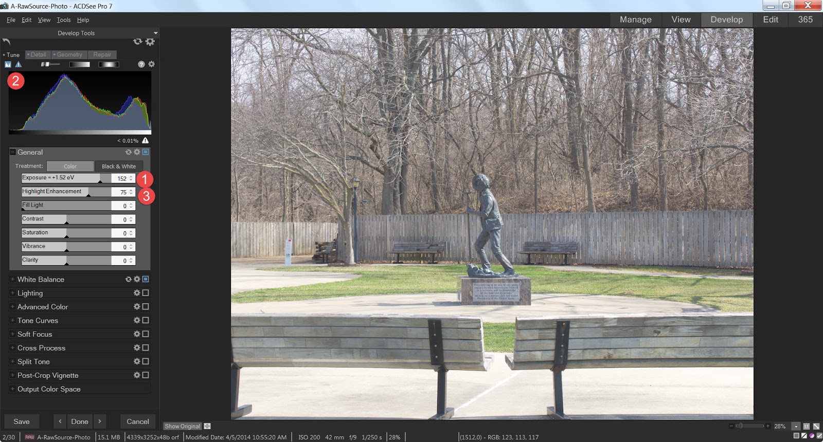 Now, let’s look at the Highlight Enhancement control. By sliding that control to the right, the highlights start to darken a bit, though the shadows and mid-tones don’t change all that much in the photo itself. But look what happens in the histogram. Notice that the portion of the curve on the far right starts to get shorter and fatter as it moves back to the left. But curiously, while the shadow and mid-tones portion of the curve do get taller because some of the highlights are being forced back to the left so there are more mid tones. and the ‘anchor point’ on the left where the shadow portion of the curve starts to take shape doesn’t move at all, the "lighter" shadows and mid tones don't really slide to the left to any significant degree.
So, what we have demonstrated is that Highlight Enhancement tries to shift the Histogram BACK to the left without adjusting the left most anchor point, and the net effect is that the shadows and mid-tones are affected less by this adjustment than are the highlights.
Fill Light Control - Oddly, this control is very similar to the exposure control, BUT what it does is respect the shadow anchor point as set by the exposure control. So in other words, the leftmost anchor point as set by the exposure control never changes as you slide the Fill light
Fill Light Control - Oddly, this control is very similar to the exposure control, BUT what it does is respect the shadow anchor point as set by the exposure control. So in other words, the leftmost anchor point as set by the exposure control never changes as you slide the Fill light
control to the right, everything else is pushed to the right. (Everything EXCEPT the shadows get brighter)
Contrast Control - This is an interesting control from a Histogram perspective. What it does when you slide the control to the right (i.e. increase contrast) is squeeze the middle portions of the curve down and push the extreme left and right sections of the curve to their respective edges of the histogram. In other words, it decreases the intensity of the mid-tones and increases the intensity of the shadows and highlights.
When you slide the control to the right (i.e. Decrease contrast), what occurs is that the intensity of the shadows and highlights decreases and the intensity of the mid-tones increases.
Saturation Control - This control is similar to brightness but deals with color purity, instead. When you slide the control to the left, the color seems to go away, when you slide the control to the right, the color becomes deeper. In a photo there are 3 colors that combine to make all the other colors. Red, Green, and Blue. if there are a lot of pixels in a given primary color, that curve will be tall. Each color has a value from -100 to +100 with the default of zero (0) .
A value of +100 for a given color means that as much of that color has been added as possible, and the curve for that color gets fatter. Saturation Control - This control is similar to brightness but deals with color purity, instead. When you slide the control to the left, the color seems to go away, when you slide the control to the right, the color becomes deeper. In a photo there are 3 colors that combine to make all the other colors. Red, Green, and Blue. if there are a lot of pixels in a given primary color, that curve will be tall. Each color has a value from -100 to +100 with the default of zero (0) .

When set to -100, the curve doesn’t go away, because the pixels set to zero are still designated as belonging to one of the 3 primary colors. they just happen to be set to -100 and all that remains is the relative luminance.
Changing the saturation value of a primary color won’t change the number of pixels assigned to a given color, it will just change the level of saturation, so the height and width of each color channel moves closer or further away from the curve representing Luminance.
Vibrance Control - The ACDSee Pro help file claims that Vibrance adjusts the intensity of the colors in the same way as saturation, but that skin tones are less affected. The text doesn't really mention other already lightly saturated objects though many people have always assumed it worked equally well on any lightly saturated object.
It does seem to protect skin better than non skin objects in a photo, but I'm not sure if that is not some sort of illusion. Logic tells me it should work equally for any lightly saturated object, but I just don't know for sure, since the difference is most noticeable for protecting skin when increasing saturation overall.
Vibrancy does seem to work LESS, on less saturated colors, but oddly, the effect is much less noticeable when moving the slider to the left (DE-saturating) than it is moving the slider to the right (adding saturation). Its effect is SO much less noticeable when de-saturating that it fooled me into thinking it wasn't working. If I were to want to de-saturate more than just a VERY tiny bit and still prevent significant change to skin tones, I might consider using a development brush to protect the skin tones completely. See the article on using development Brushes here.
I tested the Vibrance control on a series of photos where the range of skin tones was very wide, from the palest 'white', to the darkest 'black', and everything in between. Apparently, even the darkest skin isn't all that saturated overall, because I felt Vibrance protected very dark skin about as well as the lightest skin. But again, when de-saturating the protection effect was minimal.
The effects of the Vibrance control is VERY subtle. You will want to be very careful and selective in its use.
Clarity Control - This is both a useful tool and an incredibly sweet confection! What Clarity does is add or remove contrast to the mid-tones only, leaving the highlights and shadows alone.
Many people think of it as a sharpening control. I know this because when I was writing about sharpening earlier (Here), LOTS of people wrote me asking why I didn't include Clarity in the discussion.
True, Clarity can increase the illusion of sharpness, but so can contrast in general. In fact Sharpening is really no more than the technique of adding contrast to the edges of the objects. So why ISN’T clarity considered a sharpening tool instead of a general or exposure tool? Primarily, in my eyes, that is because it simply doesn’t care about the edges of objects. It will increase or decrease contrast to every mid tone it sees, edge or not.
Let’s take another look at our sample photo and its histogram:

Note how there aren’t a lot of highlights or shadows in the photo. It is mostly mid tones. Now look at the histogram, almost nothing of the curves actually reach the extreme left or right of the chart. The area of the most shadow is roughly 20% closer to the right edge of the chart than the left. And it seems the highlights don’t really even make it to the right edge! They stop about 80% of the way from the left edge to the right. I would say, that for the most part, this is a photo with very little washed out highlights or solid blacks. Just about everything resides in the mid tones area.
Just for fun, try a little experiment. With your favorite photo, invoke the clipping view (That little triangle icon just above the Histogram and below the word “Tune”) and slide the Clarity tool all the way to the right. Notice you won’t see much clipping, if any. (In my sample photo I don’t see any.), Now reset the Clarity slider and move the Contrast slider all the way to the right.
There’s a huge difference, isn't there? What is happening is that by concentrating on just the mid-tones, very little of those mid-tones are forced into either the highlights or shadows. And THAT is what makes Clarity such an important and useful tool. We can either add or remove contrast in just those tones that carry most of the photo's useful information.
Summary
That is it! Adjusting exposure in Post Processing is really nothing more than manipulation of the histogram and understanding how the various controls affect the histogram can really help you understand what it is you are doing to the photo when you start moving sliders around. You don't have to pay EXCLUSIVE attention to the histogram, you need to look at how the photo "Looks" as well. But you really need to understand what is going on, it helps when you just can't seem to get the exact look you want.
Monday, May 5, 2014
ACDSee Users, A Back up Of The Windows Registry Might Be In Order
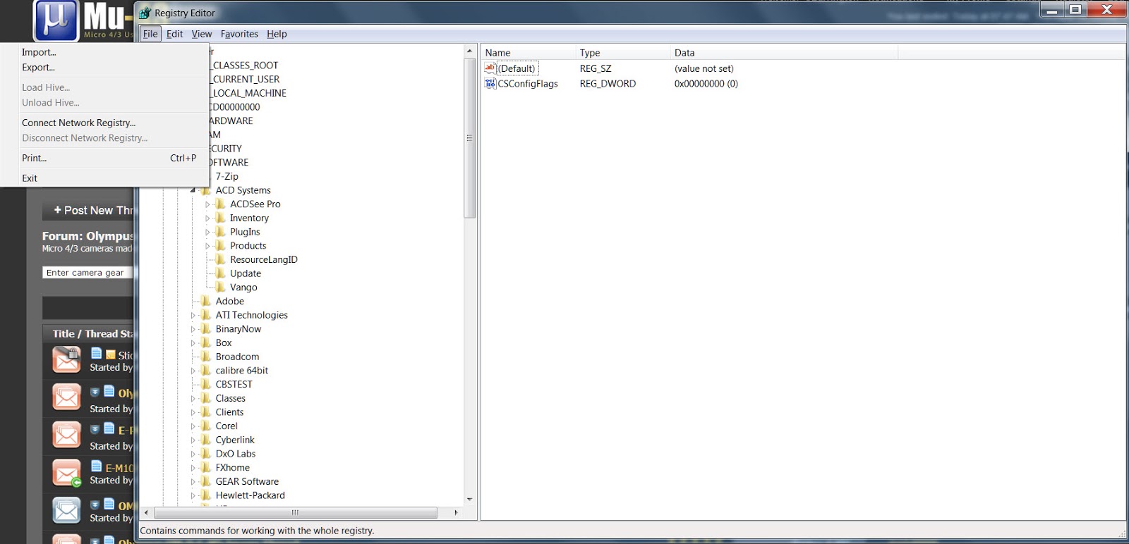
ACDSee stores the ACDSee Pro presets in the Windows registry. That means if you uninstall and re-install ACDSee Pro, you run the risk of losing any presets you may have created. And if they are willing to store presets there, what else are they using the registry for?
I suspect that the reason ACDSee is so fast and responsive is the programmer's intimate knowledge of the low level workings of the Windows OS. For this reason, I would advise you to back up your Windows registry, if for no other reason than to avoid losing your presets in a disaster recovery situation. But there might be other things you need stored there as well (ACDSee doesn't really comment on how it does things), so a Registry back up seems like a reasonable precaution.
If you are comfortable using the windows regedit program (for experienced people only) you can invoke it and export the registry to a separate file that you can treat like any other non system file and move it to someplace safe.
 If you are uncomfortable with using regedit (and you should be), there are otherwise free, open source, and commercial applications available to help you do this task. Just do an internet search on, "Windows registry backup software". I found all sorts of advice on how to do it and on products to make it easier.
I suspect that the reason ACDSee is so fast and responsive is the programmer's intimate knowledge of the low level workings of the Windows OS. For this reason, I would advise you to back up your Windows registry, if for no other reason than to avoid losing your presets in a disaster recovery situation. But there might be other things you need stored there as well (ACDSee doesn't really comment on how it does things), so a Registry back up seems like a reasonable precaution.
If you are comfortable using the windows regedit program (for experienced people only) you can invoke it and export the registry to a separate file that you can treat like any other non system file and move it to someplace safe.
If you are uncomfortable with using regedit (and you should be), there are otherwise free, open source, and commercial applications available to help you do this task. Just do an internet search on, "Windows registry backup software". I found all sorts of advice on how to do it and on products to make it easier.
But I do think this is something advanced ACDSee users need to do on a regular basis. A couple times a year, at least.
Please note, "messing" with the Windows registry is something that screw-ups and beginners should NOT do. If you do this, I take NO responsibility for the outcome! YOU ARE ON YOUR OWN.
Monday, April 28, 2014
Wayne's Old Farm, Perkins OK

I used the Olympus Zuiko, DSLR lens 14-55 mm Mark I lens with the OLY DSLR to m4/3s adapter. This was the first extended shoot I had with the combination where I wasn't trying to compare it with the kit lens, and I think it worked out well.
The lens is a bit heavier and larger than the kit lens. And Auto-focus is slow enough that I personally found manual focus to be just as effective.
The lens and camera combination is a bit out of balance. It took me a while to find the right way to hold it and to work with it. Basically, I hold the camera to my eye, and I zoom with my left hand and get 'some' idea of how I want to frame the photo. Then I support the camera/lens combo by holding the barrel of the lens with my left hand with my index and middle finger extended out to the focus ring.
I depress the shutter button half way to auto-focus with my right hand, if I feel like it, but I have Fn2 button set up as manual focus, and I generally press it for M.F. (Right hand). Manual focus is generally done with the index finger of my left hand (which is supporting the lens body combo).
I steady the camera body with my forehead, and right hand, frame and shoot. It takes MUCH longer to describe than do!
I think the extra image quality it is worth the very tiny extra bit of hassle. Follow the link here, Wayne's Old Farm, for all the other photos I am sharing.
#OMD #E-M10 #PerkinsOK #ManualFocus #Zuiko
Sunday, April 20, 2014
A Quick and Easy NR Technique
I've been researching on how to improve the noise control in ACDSee pro 7 for an ongoing series of articles I'm putting in this blog.
Ironically, I felt the need to buy Topaz Denoise to have something to compare my results against, and some of the techniques found in DeNoise can actually be used in ACDSee Pro immediately. I would think it should work with any software that is able to de-saturate and then re-saturate a photo without losing anything color wise. I should think this would include Lightroom, CaptureOne, Aftershot Pro, and the like.
When in the Develop module, make all the changes you want to a color photo. And when you are ready for noise control, in the General section, under treatment, click on Black and White. This will immediately de-saturate your photo (don't worry, the color is safe). Then go into "Detail" and make your luminance noise adjustments. It is so much easier to see the luminance noise in a B&W photo and make adjustments with the color not getting in the way of your work. When your luminance adjustment is done, go back to the General section, under treatment and click "Color". Your photo is re-saturated like it was before. Now you can go back to the Detail sub-tab and adjust for any color noise. (The noise that is left is either color noise or the luminance noise you have chosen to not address)
I think it works so well because it allows you to easily identify the TYPE of noise you are dealing with in discrete steps and avoid spending time trying to find the "balance" between color and luminance noise.
Saturday, April 19, 2014
The Histogram
Incorporating the The Histogram into an ACDSee Pro 7 Workflow
NOTE: While the comments specific to ACDSee Pro 7 are obviously unique to ACDSee Pro 7, the information and knowledge base on which those instructions were created are common to ALL editors and workflow tools. Non ACDSee users might well find that information useful.
Please assume I am working in raw, and in the “Develop Tab” of ACDSee Pro 7. In many ways, the bit mapped edit tab offers greater control of lighting. But the use of raw among “serious” photographers is so great that I feel that is the best use of our time.
Furthermore, we need to produce the best image possible from raw before creating a tif or jpg file of a photo before sending to a bit mapped editor. So if we CAN produce that quality photo in the “Develop Tab”, I think we should.
Exposure is a complex issue in post processing. It is more than merely making sure that the image isn’t TOO bright, or TOO dark. It also touches on tonality and color. Light is the foundation on which photography rests. If a photographer can’t control how that light is used, he or she can’t control how his or her images are perceived.
It is beyond the scope of this article to discuss how to get a good exposure with your camera. Post Processing control is complex enough. But any photographer is wise to learn all he or she can about getting a good initial capture. That makes post processing tasks much easier.
The uninspiring photo below will be our test photo for this tutorial.

The Histogram and Clipping View Toggle Switches
These controls reside at the top of the Develop Tab’s control window. The Histogram toggle is on the left, and the Clipping View Toggle is on the right (See image, immediately below)
The Histogram Icon and Control
This control’s Icon is blue when the Histogram is displayed as gray when not displayed, but since you can always see the histogram, when displayed, the color doesn't matter much, I guess!

The histogram is a reflection of all the changes you make to a given photo. There are three channels displayed as a line chart on an X-Y axis. It displays the number of pixels for each value of the selected channel. The vertical axis represents the number of pixels and ranges from zero to the highest number of pixels in the graph. The horizontal axis represents the value of the selected channel, from 0 to 255.
Actually the maximum number can be greater than 255. “255” is the value for an 8 bit color depth color space such as found in jpg and other 8 bit images. Tiff and raw images can also be created with a 12, 14, or 16 bit color depth. And the broader the color depth, the number of shades of color is is increased exponentially. I have found though, that thinking of a maximum number of 255 seems easier to comprehend and doesn't affect the accuracy of how I use the histogram.
Note that as the controls change, the histogram changes as well.
The left portion of the histogram describes graphically how much of the photo is in the shadows.
The right portion of the histogram describes graphically how much of the photo is in the highlights.
The center portion of the histogram describes graphically how much of the photo lies within the mid tones.
The histogram is one of the most useful tools ACDSee offers that I have ever ignored up to this point. It is useful in that it allows you to better understand the complex relationship between light, dark, tonality, and color, without letting the emotional, artistic content misdirect your attention.
As we work through the controls, I will continually refer back to the histogram to illustrate and help explain the changes that occur when the controls are set.
One thing I have noticed from writing a similar article for Corel Paint Shop Pro, is that histogram configuration is not universal. While the principles and goals of all histograms remain the same, how the developers of their respective programs choose to implement and display that photo information graphically can vary widely.
If you are using a product other than ACDSee Pro, you will have to experiment a bit to understand how the publisher of your software chooses to display histogram information. The principles I present in this article will likely remain true, however the detail will be a bit different.
My advice is to set your basic exposure information in one program, such as ACDSee Pro, and learn to use THAT histogram implementation well. If you leave the program that you have used to set exposure and lighting with a histogram and you feel the need to review the histogram, go BACK to the original program that you used to set your exposure with. Trying to interpret 2 or 3 different histogram implementations for the same photo can be confusing and lead to less than the desired results.
The Clipping View
This control’s Icon is to the right of the Histogram icon. It is blue when the clipping display is turned on and is displayed as gray when not turned on. This color indicator is useful in that it isn’t always obvious when the display is turned on, so it is helpful to have this reminder.
This control can be activated either by mouse clicking the icon,or by pressing “E” on the keyboard.
Its function is to tell you what areas of your photo are either so dark or so light that no detailed information can be displayed or seen by the viewer. You may well think that you should be able to tell that bit of info, so why do you need an additional visual indication?
It isn't always easy to see the clipped highlights and shadows on screen, and the correlation between the editing screen and a display screen or a print can vary widely. Things that you may not consider important at edit time might be very important at display time. This allows you to know this information with certainty.
Consider this Image. Other that straightening and cropping not editing has been done to it.

Note the Histogram, the shadows seem to be at their highest about ⅓ of the way from their absolute darkest. The highlights are not as high as the shadows, but at their peak, they are about ⅓ of the way from the absolute brightest. Now consider how I torture this photo:

Note the Histogram, the shadows seem to be at their highest about ⅓ of the way from their absolute darkest. The highlights are not as high as the shadows, but at their peak, they are about ⅓ of the way from the absolute brightest. Now consider how I torture this photo:
I moved the contrast control all the way to the right. Note how anything that could be considered in the shadows is green, and much of what can be considered a highlight is red. What this means is, that anything that is now green has lost all detail, it is solid black, and anything in red has ALSO lost all detail, it is solid white. Also note how there isn't very much that isn't red or black, meaning those areas still have some detail in them.
But NOW, compare the two histograms above. In the first photo, there was a lot of area under the curves in the rough middle of the chart, but in the second, the level of the curves is very low in the middle and the curve at the absolute left show significant growth where before it was non-existent. A similar occurrence appears on the far right. Though smaller than that part of the curve on the left, a bigger area has no data at all than before.
What does all this mean? By sliding the contrast to the right, I increase the contrast. This is done by brightening the light areas as much as possible and by darkening the dark areas as much as possible so that both extremes lose any detail in them (solid black or solid white). That low level of curves that remains in the middle are those areas too dark to go fully white, and too bright to go fully dark. It is these areas that will show any detail.
Below, see what the altered photo looks like without the clipping tool activated. Not very pretty, is it?

Don’t worry, I won’t be showing this many before/after photos in subsequent articles, but I wanted you to see how these changes relate to the controls and how those changes will look like in a photo. And in the future, I will point out changes to to the Histogram as I address the various controls.
I hope you find this interesting and look forward to your comments.
Subscribe to:
Posts (Atom)