Translate

Friday, October 23, 2015

The Cultural Significance of Google Photos

On a photography forum site I frequent, there is a discussion about Google Photos.  Naturally, there is the usual paranoia about how 'Evil' Google is, complaints about data mining, complaints about the lossy compression (and from a photographer's point of view that IS awful).  I think the problem is few people understand what problem it is that Google is trying to solve.  Even Google's own promotional stuff doesn't really mention the KEY problem that people have, it merely mentions the symptoms.

https://googleblog.blogspot.com/2015/10/11-things-to-know-about-google-photos.html

Google leaves it up to us to try and figure out what it is up to, and that is why we are so suspicious of Google.

In this case, after some thought, I have come to the conclusion that Google's goal is really that of preventing your phone from filling up with casual photos you want to keep, but won't need immediately.  It replaces the shoebox in the closet, full of snapshots.  It doesn't take the place of a photographer's archive, or a well thought out personal website complete with a domain name and personalized logo. It isn't even really trying to be the photo album on the coffee table in the living room.

Google seems to be the first to understand the cultural importance of that shoebox in the closet.  It is the combined story of US,  The story of not just the United States Of America, but of Canada, Britain, Australia, Japan, India, China, Brazil, Dubai, Mexico, Zimbabwe, the entire globe really.  

And in 200 years, when all of us are dead and no one remembers the photos we stored on Google Photos, and they are legally abandoned intellectual property, then Google, or the company that succeeds it, will have control of an incredible historical archive of a place and time that no longer exists but which will be important for understanding that future "now".

Will Google benefit from all that? Probably.  But I'll be dead, my future family might not have any interest in me, or even my name, much less any photos I might have taken.  Maybe this is some small way for me to remain relevant to the world long after I'm gone.  The atheist's chance at immortality, and the believer's chance to send a message through time.

Wednesday, October 21, 2015

Using The Vivitar 75-205 f/3.8 on an OMD E-M10


Conventional wisdom indicates that, when discussing the use of legacy lenses on modern cameras, it is generally best to avoid zoom lenses in favor of prime lenses.  However, I came into possession of  an elderly Vivitar 75-205 mm Zoom lens in a Canon FD mount that makes me question this 'wisdom'.  Note that I am talking about the ubiquitous, less expensive Vivitar "SuperZoom" lens and NOT the legendary Series 1 lens.

I found this lens to be sharp at all focal lengths and very sharp at the macro setting.

However, I doubt that I will use this lens very much on an Olympus OMD E-M10. It's just too big for the E-M10's body.  I found it extremely difficult to hand hold at the extreme level of magnification that the 4/3s sensor offer.  (A reminder, the 75-205 Vivitar is effectively a 150mm - 410mm lens when mounted on a camera that uses the 4/3s sensor size.).  

It seems that the "macro" setting uses a close-focusing enhancement of the 75 mm focal length.  Hand holding the E-M10 with the lens in Macro mode is extremely difficult, I think.   Below, is a hand-held macro shot,  it's better than most of the macro shots I got hand held, but if you look close, I think you can still see a bit of camera movement.
Macro mode, hand-held, 1/1600 sec f/5.6 ISO 200


Taken with a Samsung S5 Camera phone,
The ergonomics make it impossible to hold
steady.  Camera phones, UGH!
Using it on a tripod works relatively well though.  But I personally find that I don't enjoy using the E-M10 on a tripod.  To  me, the appeal of a camera this size is the ability to hand hold it for almost every shot.  And a tripod for macro shots, while essential with this lens would be GREATLY enhanced with some sort of focusing rail.  It was too hard to position the camera lens assembly by physically picking up the tripod and moving it a fraction of an inch.

I had an optional external grip installed on about half the shots, and without for the other half.  I was surprised to discover that using the grip didn't work any better than not using it.  One needs to support the camera/lens assembly by that non moving part of the lens barrel for maximum steadiness and support, so the 'grip-ability' of the body itself doesn't really factor into the way the camera and lens assembly is held and supported.

Hand held 205 mm 1/2000 sec f/5.6

This lens is prone to flare in situations where more modern lenses would not.  I have taken the photo above, several times with modern Olympus lenses at various times of day, and never saw this much flare in them.   I would recommend that a lens hood of some sort be purchased if you intend to use this lens with any regularity.

I have heard that Ponder & Best, the company that owned the Vivitar line back in the day, contracted out the manufacture of these lenses to other manufacturers, and the quality varies from manufacturer to manufacturer.

In my research, the common belief is that one can tell which manufacturer made the lens based on the first two digits of the serial number. I don't know if this is true, or not, but most of the internet web sites that deal with legacy lenses all seem to accept this as 'probably true'.

The most useful link I found that deals with Vivitar serial numbers was the Camera-Wiki.org page.  This web page also deals with the persistent rumor that Olympus made lenses for Vivitar.  Apparently, it did not, though my basic test of this particular lens indicates there would be no shame in such a move for Olympus.  My Vivitar 'superzoom' seems to be at the very least, a solid second tier lens of that era.

75 mm 1/640 sec f/5.6 iso 200
The serial number on my lens is 22713212 which indicates that it was made by Kiron.  In my serial number research, I found some legacy lens forum sites where users make the claim that the most desirable lenses were the ones made with the serial numbers of 22 - Kiron, 28 - Komine, and 37 - Tokina.  I have no way to verify these claims, so use that info at your own risk.

In summary, I think this is a fine legacy lens that is unfortunately prone to more flare than modern lenses.  It is worth seeking out and using on a fairly regular basis, but I question its value as a companion for very small camera bodies.

Wednesday, October 14, 2015

Focus Peaking is Not Perfect

It appears that focus peaking uses some sort of contrast detection methodology. While it is very useful and improves manual focus in digital cameras considerably compared to what other manual focus methods offer, it most definitely NOT perfect!

I've discovered that scenes where the edges between one object and another object are hard to see because the two objects are essentially the same color or reflect the same amount of light are difficult for focus peaking.

Try selecting your "best" OOF image sometime!
Another type of photo that I've discovered poses problems for focus peaking is situations where the areas you want to be out of focus also have areas of high contrast scattered about the scene. In this case, I've found that it isn't that focus peaking can't SEE the contrast, so much as it is that halos appear around the out of focus areas as well as the in focus areas, and the differences in the halos between the in-focus areas and the out of focus areas are so small that I can't tell exactly WHAT is in focus with any reliability.

I've learned not to fight with FP in situations where it doesn't do well. In both cases, I've found that switching to auto focus and selecting the appropriate focus point manually generally works well for me.

Tuesday, October 13, 2015

An ACDSee User's Perspective on DXO Optics Pro 10

A Good Tool
I'm an ACDSee Ultimate 9 user, but I just completed a trial of DXO Optics Pro 10.  This is a VERY brief discussion the DXO product.   This is NOT a review of DXO, merely a description of my perceptions of the product.

Actually I liked it pretty well.  I was particularly impressed with the CA/Purple fringing control. And, the auto correction tool shows a maturity that ACDSee Ultimate 9, which just introduced auto correction, simply doesn't have yet.  

Lots of lens and camera combinations in the DXO lens correction database that ACDSee doesn't have.  Especially in the area of Olympus 4/3s DSLR lenses teamed up with m43s cameras.  This will improve, I'm sure, when ACDSee comes out with the infrastructure on how to add lenses to the database ACDSee is using.

The image quality of the finished product was quite high, however I am used to a  more minimalist approach to the raw development software automatically adding in auto sharpening and noise control whenever an image is accessed via the program.  DXO made some things too crisp and sharp, I thought, for images that already had sharpness and NR already added.  I found myself backing that stuff out a bit on those sort of photos.  Not a major issue to be sure, but it was one of those minor irritants I could get used to if I had to.

You need to remember, DXO is a pure raw converter, that means there is NO database or DAM management tools built into it. So you will need some sort of front end to handle that sort of thing. I should think that if I were to use DXO, I would use ACDSee 19 (Their basic viewer/DAM software) instead of Ultimate, though Ultimate 9 worked well enough during my testing.

Overall, however, I don't feel DXO offered me enough reasons to incorporate it into my workflow. Image quality was VERY good, but so is ACDSee Ultimate 9's IQ. And by staying with one vendor from import to organizing, to raw development, to bit mapped editing, and then to distribution, I have a single set of color control tools at all times and most importantly, a single user interface. To me, the idea of a consistent user interface is a major productivity asset all by itself.

In summary, I think DXO is a fine product. I could recommend it to someone who is dissatisfied with their current processor so long as they understood that they would have to provide a separate DAM tool and bit mapped editor for a complete workflow set up.

Friday, October 9, 2015

Legacy Lenses and the "Prime Shooting Style"

I'm having great luck using my ancient Canon FL series lenses on my E-M10. They offer a subtle difference in color and tonality that we don't see with modern lenses. The only drawback with m43s is that even my WA Canon primes are effectively normal lenses or longer.

I'm using focus peaking, and I shoot with the lens stopped down all the time even during framing and focusing. I get confused by having an open/close ring on the lens, and an open/close ring on the Fotasy adapter.

With these 'all manual' lenses I have the viewfinder set to automatically brighten to accommodate the stopped down state of the lens.

These lenses are fun to use and offer unique image qualities I don't think I'd get with the Zuiko lenses.

I'm also experimenting with 'one body', 'one lens' shooting as a result of using these lenses. I select one lens, attach it to the camera and, taking just that I go out and find some way to make that body/lens combination work to make a good photo. . . somehow. If I encounter something I simply CAN'T shoot with the gear I have, I come back another day, with a different lens. I think of this as a 'layered' approach to photography.

I enjoy this sort of shooting so much, I'm thinking of getting a couple of modern Zuiko primes to see how I like shooting wide in this way.

Below, a few examples of what my Canon FL lenses can do. Click on any to enlarge:


Above, taken with Canon FL 50mm f/1.8
To the left, taken with Canon FL 100mm f/3.5


To the right, and below, taken with Canon FL 50mm f/1.8


Thursday, October 1, 2015

I Accept that Photography has a LOT of Old People In It.

And I don't care all that much. Well off, retired people have always indulged in photography. I've been involved in photography since the age of 12, when an uncle got me interested. I was fortunate enough to be able to retire at age 62, and I took that opportunity to jump into my photography with great intensity.

Are my photos "safer", less "adventurous". Possibly. but now that I have the time to explore my innerscape, I find more contemplative work more satisfying. And frankly, confronting the truth about yourself can be every bit as adventurous as jumping out of an airplane.

I don't need a portfolio of snowboarding and mountain climbing to prove I existed or that I'm cool. Things I freely admit that were considerations in my youth. I much prefer the photos that helped me come to certain conclusions about a specific character flaw I have.

We are who we are, we are connected by a love of photography, and the idea of reflecting our lives via photography. That is enough for me.

Monday, September 28, 2015

On Using the ACDSee "Photos" Tab


The "Photos" tab is a totally new feature found in the ACDSee line of Photo management and workflow software. It is available in ACDSee 19, ACDSee Pro 9, and in ACDSee Ultimate 9.

It's purpose is to display the contents of your entire photos database by date regardless of the folder structure,  This may prove useful if you know a photo exists, but you simply DON'T have enough information to search for it in a traditional manner.  It may also prove useful for those involved in commercial photo management.

Also, for those who don't want to maintain a folder structure other than one big, high level, folder into which ALL photos get dumped regardless of if they are ready for showing or not, this will likely prove VERY useful.

This feature requires no set up to use, it is fully functional upon installation of one of the three ACDSee software titles.  The date that seems to drive this feature is The Exif field called "Date/Time Original" Not "Created Date" or "Date Digitized", or "Modified Date". 


Remember the "Date/Time Original" date time stamp is editable from within ACDSee, so if photos aren't showing up in the order that you think they should be, you can change that date to suit your needs.  I have found that sometimes a "round trip" to an external editor can really get metadata messed up.  For me, Paint Shop Pro X6 can strip a lot of existing metadata from a photo and can cause a lot of trouble.  So if you use external editors, make sure they aren't ruining or changing your metadata.  


A Tour of the Photos Tab:


Note the Screen shot photo above.  You can click on it to make it larger if you choose.  I have added three colored arrows  to point out features you need to know about:

Next to the RED arrow on the left, is the dates field this will display the dates on which the photos in your database will be sorted. If you click on a date in that field any photos with the Date/Time Original date on or after that date will be displayed.  For the Annual view, only year dates will be displayed, For the monthly view, only Month and Year will be displayed, and, of course, for the Daily view the entire year ,month, and day will be displayed.

With the annual and monthly views, I have found that the displayed thumbnails are so small that they are difficult to actually SEE!  So note the GREEN arrow next to the photo of the little boy with his hand in the air.  When you roll your mouse cursor over a given thumbnail image, that image will be enlarged to a usable size.  

Also, the default viewing size will get larger as you move down the time scale of year, month, and day.  So it will be easier to see the day displayed photos than it will be to see the year displayed photos.

I have found that for me, a usable work flow for this new tab is to start with the year only search, and then once I think I have the year identified, I then view the photos in that year by month, and if necessary then by Year, Month, and Day.  Note the BLUE arrow at the bottom right of the screen.  The three grey icons allow you to change the view from annual to a more granular date.

However, I've discovered this is not the most useful way to change the date view!  An  R-Click of the mouse anywhere in the thumbnail display window will change the view to the next most detailed date. So if I am in the Year display view, and I do an R-Click, then the display will change to Year, Month display, and so on.

Also, at the top of the date display window on the left are two arrows one pointing left and one pointing right.  They will change the date view as well.


Set Up Controls:


There are some limited set up options available to the user for modifying the behavior of the Photos Tab.  See the Screen print on the left.

Show Database Orphan Files 
This option allows you to tell the photos tab to include any photos in the database, that point to a location that no longer exists.  Photos can get orphaned this way if you delete a folder containing photos using Windows Explorer or some other application that is not aware of the ACDSee database.

Mouse Cursor Hover Activates Pop-ups
This option allows you to prevent ACDSee from showing you an enlarged thumbnail if you so choose.  I wouldn't want to do this, but everyone is different in this regard.

Show Navigation Thumbnail While Scrolling
Frankly, I'm not sure WHAT this thing does! The ACDSee Ultimate 9 help files says that it 

"Activates or deactivates the animated pop-up navigation thumbnail, which displays the date on the thumbnail during scrolling. This option is to assist with orientation for users scrolling through large photo collections."

Maybe this change is so subtle, that I am confused by it, or maybe it's only useful under certain situations, but I don't see any difference in behavior, and the help file isn't all that helpful, in this case.  Use it if you want, I guess.

Sort Thumbnail Dates
Allows you to select the sort order of the thumbnails 

All in all, now that I've had time to use it a bit, I think this will have some use for me.  I am not the worlds greatest folder infrastructure maintainer, and sometimes photos get moved to folders that they have no business being in, and I have had trouble finding those photos. (I consider it a sign of brilliance)  I have wished, several times, that I could view ALL the photos in the database regardless of folder structure.  This will allow me to do that.  

I would advise other users to not dismiss this new functionality out of hand.  I think that the terminally sloppy photographer, and the compulsively neat photographer will both find this useful and a comfort.

Friday, September 25, 2015

An Experienced User's Notes on ACDSee Ultimate 9

Well ACDSee, the company released ACDSee Ultimate 9 yesterday.  It is, in my opinion, a major upgrade to an already mature and well seasoned product line.  This won't be a review, as such, so much as a comment on the overall effectiveness of ACDSee Ultimate 9 and some comments on specific new features. 

No product is 100% perfect, and neither is any product in the ACDSee line.    But Ultimate 9 seems to me to be a welcome upgrade in my eyes.

Some background on the three major products in the ACDSee line of software that sprung from the original ACDSee viewer Browser that originated in the 1990s.  Note that ACDSee sells other products as well.  These are not the only products ACDSee offers, however these are the products I most care about.

There are three products in this line, the current versions are:

  1. ACDSee 19 - This is no longer the basic photo viewer/browser of the early years.  It is a full featured media manager and media database application.  It not only allows for some pretty sophisticated management of your photos, it also allows for the simple 'touch-up edits people have come to expect with this sort of product.  Actually, when I downloaded this product, I was surprised at how sophisticated the 'Edit' tab controls were. For instance, I could even blend the unedited exposure version of a photo with the edited exposure version!  I would say, for the jpg shooter who is more of a shoot and post on social media person, but who wants to be able to touch up and crop  photos, and then track how they get used, this may be all they need.
  2. ACDSee Pro 9 - This adds Raw development and a slightly more sophisticated bit mapped editing capability to the manage functions of ACDSee 19.  In fact it looks like ACDSee 19 is lifted whole cloth and inserted into Pro 9 I don't see any significant difference between the Manage tab of ACDSee Pro 9 and the Manage tab of ACDSee 19.  I won't go into detail on the differences between the two products, ACDSee has a web page that explains the differences. This first part of the article is a summary, but there is FINALLY,  X-TRANS support!  Finally!  The Edit tab has some additional enhancements that most people will want as well.  This includes Pixel targeting, trust me you want Pixel Targeting!
  3. ACDSee Ultimate 9 - Essentially this is ACDSee Pro 9 with the addition of an enhanced Bit mapped editor with layers.
If you see a pattern where each level of software builds on the features of the one that comes before it and then adds features, you would be correct.  They all use the same database and the same user interface.  Learning one product gives you most of the skills you need to successfully use a different product.  You most definitely do NOT have to forget something to upgrade to a different and more sophisticated product.

But let's review ACDSee Ultimate 9. This is the top of the line in this series of software.  It costs the most, but it does the most.  I have listed below what I consider the major enhancements.  some of them are in U9 only, while others are also in ACDSee 19 and ACDSee Pro 9.  I won't attempt to tell you which functions are in which product.  ACDSee has a web page that does that quite well.  

My goal in this article is to give you MY impression of the new features of Ultimate 9.  Please do not consider this a formal review, mainly because I haven't spent enough time with the product to render a final judgement (AS I write this, the software was released the day before), and also I don't like final judgements on software since the review is of.a product at a particular point in time.  

The reviews rarely change or get updated, but with software upgrades, the software does, often rendering, the review less accurate than at the time of publication, but the reader has no way of knowing how accurate that review remains.  I want to avoid that problem as much as possible, so I consider these an independent, third party, set of release notes for the initial release of ACDSee Ultimate 9. If you MUST think of this as a review, think of it as a brief review of functionality.

Below are the major new features that I think most people will be interested in.  I will discuss them individually.

X-Trans Support


Well, it's about time!  Most current X-Trans users have already selected their raw development software by now.  So if ACDSee wants them to consider switching, the quality of the X-Trans conversion must be at least as good as they currently are getting.  I can't comment on the quality of the conversion itself, since I shoot m43s.  If any X-Trans users want to download a trial version, and let me know their opinions, I would be happy to publish their comments.


Adjustment Layers

This is a major feature upgrade for Ultimate 9.  The ability to mask and apply adjustments to layers in Ultimate 9 takes the layering function of Ultimate 8 from a handy convenience feature to a significant workflow tool.

Automated lens corrections (Geometric and CA)

Again, this is really important.  It was frustrating to know that my m43s system embedded distortion data into the image but that ACDSee couldn't access that information.  And manual correction was fine for gross obvious distortion, but pretty useless for more subtle correction.

It appears that ACDSee is using the Lensfun correction database, so if a particular lens profile offers CA data, then ACDSee will offer CA correction as well.  If they are using LensFun, then a simple internet search will yield all sorts of ways to create Lensfun profiles for lenses using tools many people now have.  I even found one that uses the open source stitching tool Hugin.  

However, what we need from ACDSee is clarification of, will they use a different, more proprietary, process to create new lens profiles and insert them into ACDSee; or will there be a more generic, process created?  I'm sure this announcement will come in time, the new release has only been out one day at this point.  I suspect they are now waiting for any errors and omissions to pop up so they can fix them ASAP.


Snapshots (Virtual copies)

This does not appear to be an exact one for one replication of Lightroom's Virtual copies where the database stores and displays a thumbnail of the revised image and search and select the Virtual copy as if it were an independant photo.  Instead it allows the user to save the Develop tab's, development setting and give it a name without creating a new thumbnail for that setting.  The Snapshot defaults to a datetime stamp as a default name, but clearly, more meaningful Snapshot names would be useful to most people.  Changing the default name is easy enough, so I urge users to do so.

Is this as useful, overall, as Lightroom Virtual copies?  No, it is not, though it is still VERY useful.  However I would remind you that ACDSee uses what appears to be a hierarchical database as opposed to Lightroom's Relational database.  Hierarchical databases require a different record access methodology than Relational. This alters significantly how the programmers must code their program.  Relational databases get their powerful flexibility at a price of speed though.  For those who don't like Lr's speed and response time, this may prove a most satisfactory alternative.

Action Recording and Playback

This works only in record mode in the 'Edit' Tab; and in playback mode, in the Manage and Edit tabs.  It does not work in the Develop tab at all, though I can see some valid uses for it in the Develop tab, maybe Version 10 or 11 will offer this feature.

Overall it works pretty well, you select 'record', perform an action or a series of actions in the Edit Tab, then you hit "save", give the recorded action a name.  After that, you can bring up any photo, or a Batch of photos, in either the "Manage" tab or the "Edit" tab and apply the same actions to all those photos in the order recorded.

Presently, there is no way to edit a recorded action.  If you spot an error in the recorded action file, you will need to delete that action file and create an entirely new one.  Again, a nice addition for subsequent versions, I guess.


PS Plugin Support 

I find this VERY useful, I no longer have to treat Plug-ins as standalone editors or avoid using those plug-ins that can't function as a stand alone editor.  So far, I can only confirm that it works with 64 bit plug-ins, so favorite 32 bit Plug-ins might not work.

EDIT 9/30/2015:
In a private conversation with another ACDSee user, he reports that he has successfully run Polaroid Dust and Scratch remover and Kodak ROC inside of ACDSee Ultimate 9. I want to make sure I correct any misconceptions I may have left.


Collections/Smart Collections 

I haven't played with this function much, but my feeling, so far, is that it will be quite useful. While the user interface differs pretty much from Lightroom's version, the actual concept and process pretty much works the same way.  Basically you create and name a collection and then select a group of photos right click on them and add them to the desired collection.
Smart collections seem to have a search function added to them.  At this point I haven't really used the Smart Collection feature.  If I find it particularly useful or poetentially useful I may write an article specifically on this topic.

Photos Mode

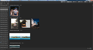
Allows you to view entire photo database regardless of location on the hard drive or in other logical ACDSee constructs.  On the Left of the screen is a narrow window of dates on which photos were taken,  And on the right, a much larger window that displays all the photos taken on, or after, that date. So, in effect, you can see your entire collection of managed photos, or a subset of photos that were taken AFTER a specific date.

I'm not sure I will use this much, but I suspect people involved in commercial photo management will find it useful.

Dehaze 

Is this a fad for the software publishers or what? It seems every publisher is adding a dehaze slider.  What does this do that can't be done with other tools?  Well I tested it out, and when compared to other techniques,where no other conditions needed to be met, it is a tiny bit better than I could do on my own.


Skin Tune

I would point you to my comments on Dehaze.  Though as a landscape and nature photographer,  I don't really use this sort of 'glamour' effect all that often, I have tried it out and I find it acceptable for my limited needs, and I suspect most other people will find it useful as well.


4K support

It's there if you need it.  I have no way to test it out.


Lightroom Database conversion 

I haven't tested, I got rid of my Lr database some time ago. But I suspect it does NOT Convert your Lr edits, but is more about metadata conversion issues.  That in itself, is not small potatoes, and may make it easier for Lightroom users to switch to ACDSee from Lr.  I wish I had it 3-4 years ago when I switched from Lr.


Summary

All in all, I would say this Windows only application has had a serious upgrade in functionality.  ACDSee Ultimate 9, still has some obvious gaps in what I think I need in an ideal photo tool, but on the whole, I like it very much.  I like it better than Lightroom, primarily for its speed of operation, and the Light equalizer (see my previous article here).  However, these, functionality enhancements really seal the deal, in my mind.   Of the new functions, I think I will use the adjustment layers, the Snapshot functions, and the Photoshop Plug-ins feature the most.  But the exciting thing is, I don't know with absolute certainty!  One of the other new tools might surprise me.

Thursday, June 18, 2015

A Review of the Fotodiox Add-on Grip for the Olympus OMD Em10


I am always surprised by the tiny size of gear manufactured for m43s cameras. I don't know why, I know full well just how tiny the E-M10 is; it's just that catalogue photos always make things seem bigger somehow. The photos give them more "presence".

Why is a grip needed, you ask? Well, I don't think if you just use the kit lens that comes with the camera that an extra grip IS needed. But if you are like me, and you sometimes enjoy using bigger and heavier lenses, the built in grip just doesn't give enough 'grip' to make that tiny camera feel balanced enough with a big lens in your hand. This is where an additional add on grip comes in handy.

The Fotodiox pro grip for the E-M10 is no different. When I opened the box, I was surprised at just how small it is. About 4.5 inches long, it fits my camera like a glove. The claim that the user has easy access to the battery and media card port is true. But the A/V - HDMI port on the right side is also available with the grip attached. The Fotodiox grip adds 2.3 ounces to the total weight of the camera body, but it is not even noticeable to me.

The base plate portion of the grip assembly is designed so that the articulated view screen can move without restriction, and the base plate sits flat when attached to the camera. The camera sits flat and doesn't wobble with the grip attached.

The attachment screw uses the tripod mount socket that is placed right behind the lens, so another tripod mount is provided offset to the left. This won't cause any significant problems for most people; but if you like to do a lot of stitching to make panoramas, it is easier to get photos to match up if the tripod pivot point is directly behind the lens. So those who like to do panorama photos might want to remove the grip when shooting for them.

But the big question is, does it make the camera easier to hold? And the answer is yes, particularly when I have attached my favorite legacy lens, the Olympus/Zuiko 14-54 Mk I originally designed for the 4/3s DSLR cameras. Those telecentric lenses are a tad bit bigger and heavier than native m43s lenses and it makes using those lenses much easier to use. I'm not certain that the smaller m43s kit lens will benefit all that much from a grip like this. It is small enough and light enough that camera movement from a too heavy lens making the assembly out of balance is not much of an issue.

I've used the grip about 6 months now. and while I don't need the grip to use the camera with the kit lens, it is just too much trouble to take off when I'm not using the larger legacy lenses, so I leave the grip on all the time. I am starting to see some paint wear on the edges of the grip.  It is happening a bit earlier than I would have hoped considering how careful I am with my gear, 


I wish Fotodiox had raised the price a dollar or so, and had applied a better paint finish to the device. Considering how inexpensive it is, there should be plenty of room for that modest price increase and still remain significantly below the price of the Olympus  branded version without affecting sales.  I've not noticed any structural problems, so my objections so far have been cosmetic only.

I kind of wish the actual grip part was a tad bit more . . . bulbous, it would be an even more comfortable grip. But the size of the camera body itself might work against this, and would certainly be a bit uglier to boot. (gotta be pretty, if you want to sell a lot of them! LOL!) I think a bigger, fatter grip would either cause the grip to be so close to the lens that there wouldn't much room for your fingers between the lens and grip, or, the grip would be expanded around the right side, perhaps blocking access to the A/V - HDMI ports. On the whole though, I find the current design an acceptable compromise between comfort and usability.


I can't compare it to the Olympus brand grip, I've never used that grip. But I think I like the Fotodiox well enough that I have no curiosity about the Oly grip. As I write this, the Fotodiox is cheaper too. It's hard to argue about a product that is well designed and cheaper.

Tuesday, June 2, 2015

Reverse Geocoding with ACDSee!


I just attended an ACDSee sponsored Webinar regarding "Image Management In The Corporate World."  I don't know why I was invited, since I am DEFINITELY an amateur when it comes to photography.  My name must have cross 'contaminated' some mailing list, I guess. However it happened, I hope it happens again!

But I'm glad I did attend. I learned a LOT about Image Management in general, and the ACDSee products in particular.

And one of the things I learned about was ACDSee 18 and its ability to set the geo codes in the EXIF long after the photo was taken.  Actually, it works with ACDSee Pro 8 and ACDSee Ultimate 8 as well.

The quick explanation is that ACDSee can use Google maps to attach a location to a given photo, then at the click of a button look up the geo code information on Google maps and insert it not only into the EXIF data, but place the conventional street address into the IPTC data as well.

I tried to duplicate this in ACDSee Ultimate 8 just to make sure it works, and it does!  This sort of thing may work with photo management software other than ACDSee, but these are the tools I use and care about, so you might want to pay some attention to the more obscure tools in your favorite software.

Here is how I did it.  As Always with Blogspot, you can click on any picture to make the photo bigger.


Above, I selected a photo to add geocodes
to.  Then I right clicked on the photo and selected "Map|Place on Map".  I could have just as easily selected tools from the menu at the top, but I didn't.


A window appears with Google Maps displayed, zoom in on the location where you recall that you took the photo.  The little bubble pointer will allow you to see where the location was placed.  Once you have the pointer placed the way you want it, then click on the button called "Reverse GeoCode".


A pop-up window appears confirming your placement.  If it is correct, click "Save".


Note that the Geocode appears in the EXIF data.  Also note below that the conventional street data also appears in the IPTC data.

Now, not everyone will likely want or need this functionality, but for those who do, this will be a great convenience for them.  I don't always need this sort of information. But when I do, it's a real pain to recreate it after the fact.  And while I may not really want the actual geocode when a simple street address might do, as I recall the webinar speaker claimed an an accuracy to within 3 meters.  I should think this would provide a lot of functionality for many people!


Friday, May 29, 2015

Topaz DeNoise Presets vs ACDSee Ultimate 8

Whenever I'm asked about noise and what noise control methods I use.  I usually say something like, "I use Topaz DeNoise for problem photos, but for simple noise control, I use the noise control tool built into ACDSee Ultimate 8.  I'm just lazy, I guess, and, well, I'm not all that bothered by noise anyway."

That's actually a pretty true statement regarding my anti noise practices and beliefs.  I would rather have a noisy photo over one of those super smooth plastic smears we sometimes see.  I don't push my m43s camera (The Olympus OMD E-M10) into extreme low light situations.  I find that the noise is reasonably manageable up to ISO levels of 2000 or so.


I don't think anyone would claim that ANY ACDSee product could be better than Topaz DeNoise.  The ability to adjust black levels and control noise found exclusively in the Red and Blue color channels alone (or Together!) make DeNoise a better noise control tool than ACDSee Ultimate 8.

But still, ACDSee's reputation as being weak when it comes to noise control is also a bit exaggerated.  It's fairly decent as a simple noise control tool.  So I tried to figure out a way to illustrate what a user could expect from  ACDSee compared to Topaz DeNoise; and I think I found a way to do so.

BEAR IN MIND! This is NOT an attempt to prove one product is better than the other, or that one is as good as the other.  People always want the drama in finding a clear winner!  What this is, is an effort to figure out just what we can expect from the two products, and maybe help us in determining when the small bit of extra effort to use DeNoise is worth it, and when it will be just as easy to use The ACDSee tools.  Also bear in mind, this is a comparison you can do with your favorite software as well.  You don't have to use ACDSee or Topaz DeNoise if you don't want to.  This methodology would work with any combination of software and any level of noise control skill on your part.


I decided that I would take a moderately noisy tiff photo (above) and use the Noise Control tool in ACDSee Ultimate 8 to control the noise to what I consider a reasonably good level of NC.  A level I'm happy with.

Then I would use the built in presets in Topaz DeNoise on the same photo and compare the two efforts.  I decided to use only the RAW settings in DeNoise since that is what Topaz suggests we use on Tif files.  I decided to use only the built-in presets since any reader could accurately predict and reproduce what the settings will be in the Topaz product.


Immediately above, is the ACDSee Ultimate 8 version with noise control adjusted to my taste and current level of skill.  As I stated before, I'm not particularly bothered by noise.  I find the lack of detail to be far more disturbing than a little noise.  And when I have to compromise (and there is ALWAYS a compromise!) I almost always opt for more detail. You can click on any photo to enlarge it for better viewing.


This is the infrastructure I used to compare, I displayed them side by side and then zoomed in on both to compare small segments.  I won't show the side by side at "Fit to screen" like this for each comparison.  That would be WAY too many photos for a single article that you would want to download.  I will use selected comparison shots to illustrate detail and highlight detail I consider important.


This is detail from the compare of the ACDSee only version on the left with the Topaz Raw Lightest on the right.  The fireplace in the ACDSee/Glen version is a lot smoother than the Topaz one it has less color noise as well. we are starting to see denoising artifacts in both with slightly fewer artifacts in the Topaz version.   Topaz seems to add a bit of red to the image, which I happen to like. I suspect it is Topaz's ability to control the Red and green channels.  I consider both acceptable, but I'd give a slight preference to ACDSee/Glen noise control in this case and to Topaz for color rendition!


Above, this compares ACDSee/Glen version to the "Raw Light" preset, it has a bit more noise control than "Raw Lightest".   ACDSee seems to have better color noise control than Topaz.  I'm beginning to think that warm tone in the Topaz version is because not enough color noise is being controlled to my taste.  This preset is also not controlling luminance noise to my taste either.  The Topaz preset doesn't offer as many denoising artifacts as the ACDSee/Glen version, but I wonder if that is even relevant except for printing VERY VERY big.  I think I still prefer ACDSee/Glen to the Topaz Raw Light preset.


We are finally seeing some adequate color noise control in the Topaz "Raw Moderate" preset.  That 'warm' cast is much less noticeable.  I think the ACDSee/Glen Version has both better Luminance and color noise control overall.  I'd still give the nod to Topaz when it comes to the denoising artifacts, I think.


The ACDSee/Glen version and the Topaz "Raw Strong" preset are almost identical.  The Topaz version has a slight edge when it comes to a little extra contrast and noise artifacts.  As is, I think I prefer the Topaz version, however now that I'm aware of the issue, I think I can incorporate a bit more contrast into my ACDSee anti-noise efforts and minimize that difference in the future.


Now, we are moving into the area where personal taste and judgement factor in more strongly.  The Topaz 'Raw Stronger' preset is at the very limits of what I find acceptable. I find the loss of detail disturbing, but under the right circumstances, I could live with this level plasticity.  I know I can use the Topaz controls to adjust this image to make it closer to my tastes,  I'm pretty sure I would use this preset as a starting point and tweak the controls to get to a point somewhere between the two examples.


I find the Topaz preset "Raw Strongest" totally unacceptable!  It's just too smeary. In my opinion, any photo that requires that level of anti-noise control would be culled.

Actually, I'm finding that, FOR ME, and an image like this, the sweet spot for using Topaz DeNoise is in that moderate to Strong level of presets.  They get me a bit closer to what I'm looking for than would ACDSee Ultimate 8 by itself.


Above, I have one last comparison to show, that is the ACDSee/Glen version run through Topaz at the "Raw Stronger" level and then bumping up the Preserve Detail, Up from 24 to 50.  That gets me a lot closer to what I would consider ideal than the presets by themselves.

So What's The Lesson From This?

I think I have confirmed that for minor noise control, my trust in the ACDSee Ultimate 8 controls are OK.  I can do more with them (and I think faster) than I can do with the lightest and moderate presets in Topaz Denoise.  But when I have something challenging, there is no way I can not use Topaz DeNoise, but I need to be prepared to use the controls to get what I'm looking for.  The presets are STARTING points, not the end results.

Saturday, May 16, 2015

Getting that Old Faded Photo Look - A Tour of Tone Curves In ACDSee Ultimate 8


This is a quick tutorial on how to recreate that washed out, 1960's Old Color Photo look by using the Tone Curves control found in ACDSee Ultimate 8 or in ACDSee Pro 8. Please note that any image in this tutorial can be 'clicked on' and the image will be enlarged.

First, A Guided Tour of the Tone Curve Control.

Coincidentally, this tutorial is also a pretty good explanation of the Tone curve control found not only in the ACDSee products, but in almost every other photo editing product on the market.

You know, we often see on various photo web sites newbies posting someone else's photo that emulates this look and then asking, "how did they get that look?"

And, often times more experienced users will point to various add on programs to do this thing and then the newbies go out and buy that new software, when in all likelihood they not only already have the means to do it, but they also have the required skills to do this without spending any extra money whatsoever!

The truth is, that just about ANY software that has a tone curves control can replicate this look very easily. That means if you own Photoshop, Photoshop Elements, Lightroom, ACDSee Pro 8 or Ultimate, Paintshop Pro, Gimp or a host of other photographic software, this look is already well within your means and skill level, no matter how much of a newbie you are. So lets get started, and explore this technique.


To the Right and above,, is he tone curves control in the ACDSee Ultimate 8 Raw development tab. It has all the conventional functionality found in most tone curve controls and a few things added to make it more useful for raw development processing.

To the left, is the tone curves control found in the ACDSee Ultimate 8 Edit tab. It too has all of the conventional functionality found in most tone curve controls but without the raw development considerations of of the Development tab.

Now, the question as to why there are two separate tabs in ACDSee that offer many of the same controls is beyond the scope of this tutorial. At this point, let's just say that some photographers who use jpg and tif based photos sometimes find it easier to deal with them without having to worry about the raw development tools complicating their choices.

For this tutorial, we can use either, or some other software completely, for that matter, and it won't make much difference. I personally prefer to use the Development tab controls whenever possible,


Before we get involved with the changes we intend to make, lets first discuss the controls we see in the tone curve control group. The first, most obvious, is the curve display itself.

Note there are two default anchor points on the diagonal line that represents the tone curve.

As in a live histogram, the left side of the tone curve chart represents the shadows, while the right side of that same chart represents the highlights, and of course, the area in the middle is what we call the mid-tones.

But in the typical tone curve control set up we also have the luxury of moving those control points and any control points we subsequently create, up and down as well as left and right. If we are trying to control lighting, the up and down movement controls how light or how dark those shadows, mid tones, and Highlights are.


Also remember that if we are trying to control the intensity of one or more of the color channels, that is, the Red, Green, or Blue channels which make up ALL of the other colors we see, that up and down movement of the control points controls color intensity.

Note the little Drop Down box next to the word “Channel:”.  There are 4 options, "RGB" which combines all 3 channels into a single brightness channel, and then an “R” for Red, a “G” for Green, and a “B” for Blue. These three primary colors combine to control every color available in the photo!

With these channels I can tell the Tone Curve Control to adjust brightness in specific areas of the chart, or by individually controlling the level of color intensity for each channel, I can control the tinting and shading of all the colors

Lets play with the up and down and left right movement a little bit. Note that when I grab the default shadow and move it up towards the top of the chart, while leaving it at the furthest left most horizontal position, the photo gets a little washed out.


That's because I'm saying to the editor, "Hey editor! I care about ALL the shadow that is in this photo, however I don't want the blackest part of the shadow to be as dark as it is! Lighten things up a bit for me will you?"

Now when I leave the shadow anchor point alone but move the Highlight anchor point DOWN, notice that the contrast goes down compared to what it was. Thats because we are telling ACDSee Ultimate 8 that we want the highlights to be LESS bright.

Let's try one more thing, move the shadow anchor point to the right. Note the odd situation of a sort of dull High contrast combination. This is because moving the Shadow anchor point to the right tells ACDSee Pro 8 (or Ultimate 8) that we only care about the shadows to the right of the anchor point. ACDSee will only do its best to display detail reflected to the right of the anchor point. Everything to the Left of the anchor point is allowed to full black.


Let's have a little logic test. What do you think will occur if we move the highlights Default anchor point to the LEFT?

If you answered that the contrast would go up, then you would be correct. The reason is, that We are telling ACDSee Ultimate 8 (or Pro 8) that we only care about the highlights to the left of the Highlight anchor point. ACDSee will only protect the detail to the left of the anchor point and allow the highlight detail on the right of the anchor point to display as WHITE.


But of course, as I mentioned earlier, We can create our own anchor points. Let's reset the Tone curve controls to their original default setting. We can do this by clicking on the little 'gear wheel' in the Tone curve window which resets only the tone curve controls; OR clicking on the larger 'gear wheel' at the top of the screen. This wheel resets ALL controls, not just the tone curve controls, to their default settings. In this particular case, either window will work for us, since the only changes we have made are to the tone curve controls.

To create a Tone curve anchor point, merely click on any point in the Tone Curve chart. You can click on the default curve line itself and drag it to the location you want, or you can click on any area of the chart and the curve will adjust itself to to where ever your cursor is pointing.


You can do this with the Channel called RGB, which is effectively the brightness channel, Or you can select either “R”, “G”, or “B” and adjust them manually.

Now this is pretty much the operational theory behind the various Tone Curve controls for almost every software package on the market. If you understand what we've done so far, You should have very little trouble using any Tone Curve control you encounter.


How to achieve that 1960's, Washed Out Old Photo Look.

Now let's do something practical! AS promised I will show you how to recreate that washed out look so popular right now. And best of all, it is SUPER easy, and super FAST.  Best of all, you don't have to buy any additional software if you already own software with a tone curves control.  I'm bored with the photo we've been using, let's try something else.

First, lighten the photo, so the deepest blacks are washed out a bit.


I notice that while I like how the blacks are pleasantly washed out, I don't particularly like what it has done to the contrast overall. I think much of this photo's dynamic comes from contrast. But by experimenting, I realize that pulling down the mid tones changes the balance of contrast and I don't want that. 


What I want is to add back at least part of the 'pop' that comes from contrast without getting rid of the washed out look of the shadows.  So I then created a new control point a bit past the mid tones and pulled the curve up a bit. This allows me to have a washed out look with a bit of pop in the contrast.

This is almost right, but we really haven't accounted for the slow deterioration of the color dyes in an old photo. As a result, I brought up the Red channel a bit. If you so chose, you could replace Green with Red, or combine Green with Red to go with a more yellow look, if you so chose. That's a question of your artistic judgement.


That's it! This short tutorial has not only given you a guided tour of ACDSee Pro 8 and Ultimate 8's Tone Curves control, but gave an example of how the control can be used for a specific effect. I hope you have found it useful.