Translate

Showing posts with label ACDSee Ultimate. Show all posts

Friday, August 26, 2016

NIK and Topaz Tools Strange Color Shift!

I've discovered an anomaly when using NIK Color Efex Pro 4 quite by accident. It's not restricted to just NIK tools, as I've also seen it In Topaz Detail 3 and Topaz Adjust 5. I have NOT seen it in Topaz Denoise 6, But to be fair, Denoise underwent a major rewrite lately and I wonder if that is why it doesn't exhibit this flaw.

Let me give you some history.

When I installed the NIK tools in ACDSee Ultimate 9, I noticed that color and tonality from within NIK Color Efex was different from the color and tonality of the photo I sent to NIK Color Efex from ACDSee Ultimate 9.  It was driving me crazy!

Note the Sample Image Below:

The comparison between ACDSee Ultimate 9 and NIK Color Efex.  The difference is quite noticable.  Click on any photo to see it larger.


I discovered that if the photo's color profile was set to Pro Photo RGB then the color difference between the version displayed in ACDSee and the version displayed in NIK Color Efex was quite pronounced.

So I tried to invoke Color Efex from Corel PSP X8, and the colors were the same! At first, I was calling ACDSee all sorts of names, but then I noticed that PSP was ALWAYS converting the ProPhoto version to SRGB upon receiving the photo. (I checked and apparently PSP X8 doesn't support Pro Photo and defaults to SRGB!)

So I converted the Pro Photo color profile for my test photo to ARGB and to SRGB, and then invoked NIK Color EFEX 4 from ACDSee Ultimate 9 as a plugin.
All three color profiles look roughly the same When displayed in ACDSee Ultimate 9.  Click on any photo to see it larger


ARGB in NIK was very close but not identical to the sent ARGB version. 

I don't know if this screen print shows this, but there is a slightly extra amount of yellow in the NIK version, though I doubt the color shift is enough to make the NIK version unreliable, or even noticeable in most cases.  Click on any photo to see it larger.

The SRGB in NIK was virtually identical. 

Click on any photo to see it larger.

I brought this up on a popular photo forum, and another user reported the same behavior on Affinity Photo.  So, apparently this goes beyond ACDSee and Windows.

I'm not sure what the right thing would be for ACDSee to do in this case (if ANYTHING, is this really their problem?)   But if you are experiencing this odd color shift with NIK or other plugins, you might want to look into this possible cause!

Thursday, April 7, 2016

Using Smart Collections in ACDSee


Updated with new information on search criteria logic, on 4/19/2016

In photo management, we often times have to create regular collections of current photos for a variety of reasons.  We might want to identify all the photos that have been taken by an E-M10 camera and cropped, for instance.

We could do this with a series of saved searches and this would work fine.  However, if you have a large number of searches saved, it might be difficult to find the exact search you are looking for because all the saved search names sound alike, or because they are listed in alphabetical order and the first search you need to run, is separated by 50 other saved searches.

This is where ACDSee's Smart Collections come in handy.  These are really nothing more than saved searches, but they have a hierarchical storage infrastructure associated with them.  This allows the user to group the Smart Collections (i.e. the searches) in ways so that similar Smart Collections are easy to find and are physically close to each other because they are in the same category of smart collections. See the screen print below (note: click on any photo/screen print to make it bigger):

The results of a smart collection search can be selected and used in a variety of batch processes including placing them in a regular Collection (a collection without a saved search associated with it).  So, with that capability, you could run a series of smart searches, and after each smart search is run, you could place the results into a regular collection, and thereby build up a larger collection of similar results built on that sequence of searches.

Unfortunately, none of the ACDSee software programs have the ability to run all the smart collections in the collection set and then treat  them as if they were the results of a single search. So for now, we must manually run each search within a collection set and manually process the results.  

HEY ACDSEE!  That would be a good idea for some future update!  It would ALSO  be a good idea to allow ACDSee Action Scripts to be created for the manage tab as well as the edit tab.  Think how cool it would be to be able to batch process the results of a search or a smart collection with an ACDSee Action script!

How to Create a Smart Collection

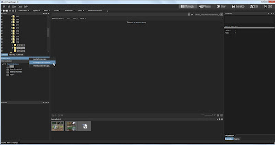
The first thing we need to do is right click on the Collections bar in the collections window (See the screen print below).  From the drop down menu, select "Create Smart Collection"  When you have done that, the creation window appears.

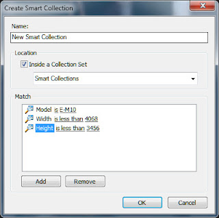
What you do with this window should be intuitive, plus it pretty much looks like the saved search window.

Below, is how to fill out the fields in such a window:

Name:  This should be the name of the smart collection you are creating.  In the example below, I have yet to type in the name of the Smart collection. It should read, "E-M10 Photos that have been cropped", but sadly, I neglected to do this.

Location:  If you check the "Inside a Collection Set" Check box, you then need to specify the collection set under which your new smart collection will reside.  You don't have to do this right now, since you can create the Collection Set later and then drag and drop the collections to rearrange them later.  But you can do that at this point if you want to.

Match:  This is where you describe the search criteria.  Click on the "Add" button and a list of virtually every attribute that the ACDSee supports will appear.  Select  attribute that you want to search on and it appears in the window.

You will note that if you click on the word "is", a drop down selection menu will appear giving selection logic options.  The exact search criteria options will vary according to the metadata field you are searching on.  The search criteria logic list is:
  • IS
  • IS NOT
  • IS LESS THAN
  • IS LESS THAN OR EQUAL TO
  • IS GREATER THAN
  • IS GREATER THAN OR EQUAL TO
  • IS BETWEEN
  • IS ANY OF
  • CONTAINS
  • STARTS WITH
If you click on the "0" after the "IS" Then a text box will appear allowing you to specify the value you want the search criteria to look for.

I find the "IS ANY OF" particularly useful in that it will allow you to select a series of values separated with commas.

You can add as many of these "Match" clauses as you want.  However, all multiple 'matches' will be considered 'AND' logic.  there is no "OR" logic, and no "AND IS NOT" logic linking the series of match clauses (though that logic may be allowed within the search clause itself).  You can eliminate and identify groupings within the Smart Collection results in the Filter menu above the Smart collection results.


How I found my 'Cropped Photos'

I now shoot a micro 43s camera called the Olympus E-M10, and I shoot raw mostly.  So I know that the uncropped size of my camera's raw image is 4068 pixels wide by 3456 pixels wide. If I want to find the photos that are cropped, I know that the width has to be LESS than 4068 pixels wide, and the Height must be less than 3456 pixels high.  if they equal those sizes, they are not cropped. 

Now the problem is I've shot with a Canon G3 in the past and my wife's cameras as well and those tiny sensors make pictures SMALLER than the m43s image (in terms of pixel size). And the problem with that is THEY will all be included in the dimension criteria whether they are cropped or uncropped, because their default size is something less than the larger m43s size.  So I need to also specify that the model name stored in the data base to exclude those cameras from the search.

If I want to find the cropped photos from the other cameras as well, I need to figure out what the default image sizes for those cameras are and create a Smart Collection for them, and store them in the same collection set as the one for my E-M10.

To find those that have only been cropped for the width, but not the height, I would also have to create searches for the specific camera and only specify the width parameter but not the height, and place them in my cropped collection set.

Then to find all the cropped photos I have to run each smart collection individually, select the results from that Smart collection and manually place them in a regular (i.e. "dumb") collection common to all the related smart collections.  It can be a bit of a hassle to do that process 3 or 4 times to compile a collection of all cropped photos.  This is why ACDSee needs to figure out a way to automate running all the smart collections in a set and treating them as a single common result set.

On the whole, while smart collections have their faults, I would estimate that more than 80-90% of the time, the way smart collections are currently configured, the user will have no problems getting what he or she wants from them.  However, that last 10% or so is going to prove problematic.


Monday, September 28, 2015

On Using the ACDSee "Photos" Tab


The "Photos" tab is a totally new feature found in the ACDSee line of Photo management and workflow software. It is available in ACDSee 19, ACDSee Pro 9, and in ACDSee Ultimate 9.

It's purpose is to display the contents of your entire photos database by date regardless of the folder structure,  This may prove useful if you know a photo exists, but you simply DON'T have enough information to search for it in a traditional manner.  It may also prove useful for those involved in commercial photo management.

Also, for those who don't want to maintain a folder structure other than one big, high level, folder into which ALL photos get dumped regardless of if they are ready for showing or not, this will likely prove VERY useful.

This feature requires no set up to use, it is fully functional upon installation of one of the three ACDSee software titles.  The date that seems to drive this feature is The Exif field called "Date/Time Original" Not "Created Date" or "Date Digitized", or "Modified Date". 


Remember the "Date/Time Original" date time stamp is editable from within ACDSee, so if photos aren't showing up in the order that you think they should be, you can change that date to suit your needs.  I have found that sometimes a "round trip" to an external editor can really get metadata messed up.  For me, Paint Shop Pro X6 can strip a lot of existing metadata from a photo and can cause a lot of trouble.  So if you use external editors, make sure they aren't ruining or changing your metadata.  


A Tour of the Photos Tab:


Note the Screen shot photo above.  You can click on it to make it larger if you choose.  I have added three colored arrows  to point out features you need to know about:

Next to the RED arrow on the left, is the dates field this will display the dates on which the photos in your database will be sorted. If you click on a date in that field any photos with the Date/Time Original date on or after that date will be displayed.  For the Annual view, only year dates will be displayed, For the monthly view, only Month and Year will be displayed, and, of course, for the Daily view the entire year ,month, and day will be displayed.

With the annual and monthly views, I have found that the displayed thumbnails are so small that they are difficult to actually SEE!  So note the GREEN arrow next to the photo of the little boy with his hand in the air.  When you roll your mouse cursor over a given thumbnail image, that image will be enlarged to a usable size.  

Also, the default viewing size will get larger as you move down the time scale of year, month, and day.  So it will be easier to see the day displayed photos than it will be to see the year displayed photos.

I have found that for me, a usable work flow for this new tab is to start with the year only search, and then once I think I have the year identified, I then view the photos in that year by month, and if necessary then by Year, Month, and Day.  Note the BLUE arrow at the bottom right of the screen.  The three grey icons allow you to change the view from annual to a more granular date.

However, I've discovered this is not the most useful way to change the date view!  An  R-Click of the mouse anywhere in the thumbnail display window will change the view to the next most detailed date. So if I am in the Year display view, and I do an R-Click, then the display will change to Year, Month display, and so on.

Also, at the top of the date display window on the left are two arrows one pointing left and one pointing right.  They will change the date view as well.


Set Up Controls:


There are some limited set up options available to the user for modifying the behavior of the Photos Tab.  See the Screen print on the left.

Show Database Orphan Files 
This option allows you to tell the photos tab to include any photos in the database, that point to a location that no longer exists.  Photos can get orphaned this way if you delete a folder containing photos using Windows Explorer or some other application that is not aware of the ACDSee database.

Mouse Cursor Hover Activates Pop-ups
This option allows you to prevent ACDSee from showing you an enlarged thumbnail if you so choose.  I wouldn't want to do this, but everyone is different in this regard.

Show Navigation Thumbnail While Scrolling
Frankly, I'm not sure WHAT this thing does! The ACDSee Ultimate 9 help files says that it 

"Activates or deactivates the animated pop-up navigation thumbnail, which displays the date on the thumbnail during scrolling. This option is to assist with orientation for users scrolling through large photo collections."

Maybe this change is so subtle, that I am confused by it, or maybe it's only useful under certain situations, but I don't see any difference in behavior, and the help file isn't all that helpful, in this case.  Use it if you want, I guess.

Sort Thumbnail Dates
Allows you to select the sort order of the thumbnails 

All in all, now that I've had time to use it a bit, I think this will have some use for me.  I am not the worlds greatest folder infrastructure maintainer, and sometimes photos get moved to folders that they have no business being in, and I have had trouble finding those photos. (I consider it a sign of brilliance)  I have wished, several times, that I could view ALL the photos in the database regardless of folder structure.  This will allow me to do that.  

I would advise other users to not dismiss this new functionality out of hand.  I think that the terminally sloppy photographer, and the compulsively neat photographer will both find this useful and a comfort.

Tuesday, June 2, 2015

Reverse Geocoding with ACDSee!


I just attended an ACDSee sponsored Webinar regarding "Image Management In The Corporate World."  I don't know why I was invited, since I am DEFINITELY an amateur when it comes to photography.  My name must have cross 'contaminated' some mailing list, I guess. However it happened, I hope it happens again!

But I'm glad I did attend. I learned a LOT about Image Management in general, and the ACDSee products in particular.

And one of the things I learned about was ACDSee 18 and its ability to set the geo codes in the EXIF long after the photo was taken.  Actually, it works with ACDSee Pro 8 and ACDSee Ultimate 8 as well.

The quick explanation is that ACDSee can use Google maps to attach a location to a given photo, then at the click of a button look up the geo code information on Google maps and insert it not only into the EXIF data, but place the conventional street address into the IPTC data as well.

I tried to duplicate this in ACDSee Ultimate 8 just to make sure it works, and it does!  This sort of thing may work with photo management software other than ACDSee, but these are the tools I use and care about, so you might want to pay some attention to the more obscure tools in your favorite software.

Here is how I did it.  As Always with Blogspot, you can click on any picture to make the photo bigger.


Above, I selected a photo to add geocodes
to.  Then I right clicked on the photo and selected "Map|Place on Map".  I could have just as easily selected tools from the menu at the top, but I didn't.


A window appears with Google Maps displayed, zoom in on the location where you recall that you took the photo.  The little bubble pointer will allow you to see where the location was placed.  Once you have the pointer placed the way you want it, then click on the button called "Reverse GeoCode".


A pop-up window appears confirming your placement.  If it is correct, click "Save".


Note that the Geocode appears in the EXIF data.  Also note below that the conventional street data also appears in the IPTC data.

Now, not everyone will likely want or need this functionality, but for those who do, this will be a great convenience for them.  I don't always need this sort of information. But when I do, it's a real pain to recreate it after the fact.  And while I may not really want the actual geocode when a simple street address might do, as I recall the webinar speaker claimed an an accuracy to within 3 meters.  I should think this would provide a lot of functionality for many people!


Saturday, May 16, 2015

Getting that Old Faded Photo Look - A Tour of Tone Curves In ACDSee Ultimate 8


This is a quick tutorial on how to recreate that washed out, 1960's Old Color Photo look by using the Tone Curves control found in ACDSee Ultimate 8 or in ACDSee Pro 8. Please note that any image in this tutorial can be 'clicked on' and the image will be enlarged.

First, A Guided Tour of the Tone Curve Control.

Coincidentally, this tutorial is also a pretty good explanation of the Tone curve control found not only in the ACDSee products, but in almost every other photo editing product on the market.

You know, we often see on various photo web sites newbies posting someone else's photo that emulates this look and then asking, "how did they get that look?"

And, often times more experienced users will point to various add on programs to do this thing and then the newbies go out and buy that new software, when in all likelihood they not only already have the means to do it, but they also have the required skills to do this without spending any extra money whatsoever!

The truth is, that just about ANY software that has a tone curves control can replicate this look very easily. That means if you own Photoshop, Photoshop Elements, Lightroom, ACDSee Pro 8 or Ultimate, Paintshop Pro, Gimp or a host of other photographic software, this look is already well within your means and skill level, no matter how much of a newbie you are. So lets get started, and explore this technique.


To the Right and above,, is he tone curves control in the ACDSee Ultimate 8 Raw development tab. It has all the conventional functionality found in most tone curve controls and a few things added to make it more useful for raw development processing.

To the left, is the tone curves control found in the ACDSee Ultimate 8 Edit tab. It too has all of the conventional functionality found in most tone curve controls but without the raw development considerations of of the Development tab.

Now, the question as to why there are two separate tabs in ACDSee that offer many of the same controls is beyond the scope of this tutorial. At this point, let's just say that some photographers who use jpg and tif based photos sometimes find it easier to deal with them without having to worry about the raw development tools complicating their choices.

For this tutorial, we can use either, or some other software completely, for that matter, and it won't make much difference. I personally prefer to use the Development tab controls whenever possible,


Before we get involved with the changes we intend to make, lets first discuss the controls we see in the tone curve control group. The first, most obvious, is the curve display itself.

Note there are two default anchor points on the diagonal line that represents the tone curve.

As in a live histogram, the left side of the tone curve chart represents the shadows, while the right side of that same chart represents the highlights, and of course, the area in the middle is what we call the mid-tones.

But in the typical tone curve control set up we also have the luxury of moving those control points and any control points we subsequently create, up and down as well as left and right. If we are trying to control lighting, the up and down movement controls how light or how dark those shadows, mid tones, and Highlights are.


Also remember that if we are trying to control the intensity of one or more of the color channels, that is, the Red, Green, or Blue channels which make up ALL of the other colors we see, that up and down movement of the control points controls color intensity.

Note the little Drop Down box next to the word “Channel:”.  There are 4 options, "RGB" which combines all 3 channels into a single brightness channel, and then an “R” for Red, a “G” for Green, and a “B” for Blue. These three primary colors combine to control every color available in the photo!

With these channels I can tell the Tone Curve Control to adjust brightness in specific areas of the chart, or by individually controlling the level of color intensity for each channel, I can control the tinting and shading of all the colors

Lets play with the up and down and left right movement a little bit. Note that when I grab the default shadow and move it up towards the top of the chart, while leaving it at the furthest left most horizontal position, the photo gets a little washed out.


That's because I'm saying to the editor, "Hey editor! I care about ALL the shadow that is in this photo, however I don't want the blackest part of the shadow to be as dark as it is! Lighten things up a bit for me will you?"

Now when I leave the shadow anchor point alone but move the Highlight anchor point DOWN, notice that the contrast goes down compared to what it was. Thats because we are telling ACDSee Ultimate 8 that we want the highlights to be LESS bright.

Let's try one more thing, move the shadow anchor point to the right. Note the odd situation of a sort of dull High contrast combination. This is because moving the Shadow anchor point to the right tells ACDSee Pro 8 (or Ultimate 8) that we only care about the shadows to the right of the anchor point. ACDSee will only do its best to display detail reflected to the right of the anchor point. Everything to the Left of the anchor point is allowed to full black.


Let's have a little logic test. What do you think will occur if we move the highlights Default anchor point to the LEFT?

If you answered that the contrast would go up, then you would be correct. The reason is, that We are telling ACDSee Ultimate 8 (or Pro 8) that we only care about the highlights to the left of the Highlight anchor point. ACDSee will only protect the detail to the left of the anchor point and allow the highlight detail on the right of the anchor point to display as WHITE.


But of course, as I mentioned earlier, We can create our own anchor points. Let's reset the Tone curve controls to their original default setting. We can do this by clicking on the little 'gear wheel' in the Tone curve window which resets only the tone curve controls; OR clicking on the larger 'gear wheel' at the top of the screen. This wheel resets ALL controls, not just the tone curve controls, to their default settings. In this particular case, either window will work for us, since the only changes we have made are to the tone curve controls.

To create a Tone curve anchor point, merely click on any point in the Tone Curve chart. You can click on the default curve line itself and drag it to the location you want, or you can click on any area of the chart and the curve will adjust itself to to where ever your cursor is pointing.


You can do this with the Channel called RGB, which is effectively the brightness channel, Or you can select either “R”, “G”, or “B” and adjust them manually.

Now this is pretty much the operational theory behind the various Tone Curve controls for almost every software package on the market. If you understand what we've done so far, You should have very little trouble using any Tone Curve control you encounter.


How to achieve that 1960's, Washed Out Old Photo Look.

Now let's do something practical! AS promised I will show you how to recreate that washed out look so popular right now. And best of all, it is SUPER easy, and super FAST.  Best of all, you don't have to buy any additional software if you already own software with a tone curves control.  I'm bored with the photo we've been using, let's try something else.

First, lighten the photo, so the deepest blacks are washed out a bit.


I notice that while I like how the blacks are pleasantly washed out, I don't particularly like what it has done to the contrast overall. I think much of this photo's dynamic comes from contrast. But by experimenting, I realize that pulling down the mid tones changes the balance of contrast and I don't want that. 


What I want is to add back at least part of the 'pop' that comes from contrast without getting rid of the washed out look of the shadows.  So I then created a new control point a bit past the mid tones and pulled the curve up a bit. This allows me to have a washed out look with a bit of pop in the contrast.

This is almost right, but we really haven't accounted for the slow deterioration of the color dyes in an old photo. As a result, I brought up the Red channel a bit. If you so chose, you could replace Green with Red, or combine Green with Red to go with a more yellow look, if you so chose. That's a question of your artistic judgement.


That's it! This short tutorial has not only given you a guided tour of ACDSee Pro 8 and Ultimate 8's Tone Curves control, but gave an example of how the control can be used for a specific effect. I hope you have found it useful.