Translate

Friday, May 29, 2015

Topaz DeNoise Presets vs ACDSee Ultimate 8

Whenever I'm asked about noise and what noise control methods I use.  I usually say something like, "I use Topaz DeNoise for problem photos, but for simple noise control, I use the noise control tool built into ACDSee Ultimate 8.  I'm just lazy, I guess, and, well, I'm not all that bothered by noise anyway."

That's actually a pretty true statement regarding my anti noise practices and beliefs.  I would rather have a noisy photo over one of those super smooth plastic smears we sometimes see.  I don't push my m43s camera (The Olympus OMD E-M10) into extreme low light situations.  I find that the noise is reasonably manageable up to ISO levels of 2000 or so.


I don't think anyone would claim that ANY ACDSee product could be better than Topaz DeNoise.  The ability to adjust black levels and control noise found exclusively in the Red and Blue color channels alone (or Together!) make DeNoise a better noise control tool than ACDSee Ultimate 8.

But still, ACDSee's reputation as being weak when it comes to noise control is also a bit exaggerated.  It's fairly decent as a simple noise control tool.  So I tried to figure out a way to illustrate what a user could expect from  ACDSee compared to Topaz DeNoise; and I think I found a way to do so.

BEAR IN MIND! This is NOT an attempt to prove one product is better than the other, or that one is as good as the other.  People always want the drama in finding a clear winner!  What this is, is an effort to figure out just what we can expect from the two products, and maybe help us in determining when the small bit of extra effort to use DeNoise is worth it, and when it will be just as easy to use The ACDSee tools.  Also bear in mind, this is a comparison you can do with your favorite software as well.  You don't have to use ACDSee or Topaz DeNoise if you don't want to.  This methodology would work with any combination of software and any level of noise control skill on your part.


I decided that I would take a moderately noisy tiff photo (above) and use the Noise Control tool in ACDSee Ultimate 8 to control the noise to what I consider a reasonably good level of NC.  A level I'm happy with.

Then I would use the built in presets in Topaz DeNoise on the same photo and compare the two efforts.  I decided to use only the RAW settings in DeNoise since that is what Topaz suggests we use on Tif files.  I decided to use only the built-in presets since any reader could accurately predict and reproduce what the settings will be in the Topaz product.


Immediately above, is the ACDSee Ultimate 8 version with noise control adjusted to my taste and current level of skill.  As I stated before, I'm not particularly bothered by noise.  I find the lack of detail to be far more disturbing than a little noise.  And when I have to compromise (and there is ALWAYS a compromise!) I almost always opt for more detail. You can click on any photo to enlarge it for better viewing.


This is the infrastructure I used to compare, I displayed them side by side and then zoomed in on both to compare small segments.  I won't show the side by side at "Fit to screen" like this for each comparison.  That would be WAY too many photos for a single article that you would want to download.  I will use selected comparison shots to illustrate detail and highlight detail I consider important.


This is detail from the compare of the ACDSee only version on the left with the Topaz Raw Lightest on the right.  The fireplace in the ACDSee/Glen version is a lot smoother than the Topaz one it has less color noise as well. we are starting to see denoising artifacts in both with slightly fewer artifacts in the Topaz version.   Topaz seems to add a bit of red to the image, which I happen to like. I suspect it is Topaz's ability to control the Red and green channels.  I consider both acceptable, but I'd give a slight preference to ACDSee/Glen noise control in this case and to Topaz for color rendition!


Above, this compares ACDSee/Glen version to the "Raw Light" preset, it has a bit more noise control than "Raw Lightest".   ACDSee seems to have better color noise control than Topaz.  I'm beginning to think that warm tone in the Topaz version is because not enough color noise is being controlled to my taste.  This preset is also not controlling luminance noise to my taste either.  The Topaz preset doesn't offer as many denoising artifacts as the ACDSee/Glen version, but I wonder if that is even relevant except for printing VERY VERY big.  I think I still prefer ACDSee/Glen to the Topaz Raw Light preset.


We are finally seeing some adequate color noise control in the Topaz "Raw Moderate" preset.  That 'warm' cast is much less noticeable.  I think the ACDSee/Glen Version has both better Luminance and color noise control overall.  I'd still give the nod to Topaz when it comes to the denoising artifacts, I think.


The ACDSee/Glen version and the Topaz "Raw Strong" preset are almost identical.  The Topaz version has a slight edge when it comes to a little extra contrast and noise artifacts.  As is, I think I prefer the Topaz version, however now that I'm aware of the issue, I think I can incorporate a bit more contrast into my ACDSee anti-noise efforts and minimize that difference in the future.


Now, we are moving into the area where personal taste and judgement factor in more strongly.  The Topaz 'Raw Stronger' preset is at the very limits of what I find acceptable. I find the loss of detail disturbing, but under the right circumstances, I could live with this level plasticity.  I know I can use the Topaz controls to adjust this image to make it closer to my tastes,  I'm pretty sure I would use this preset as a starting point and tweak the controls to get to a point somewhere between the two examples.


I find the Topaz preset "Raw Strongest" totally unacceptable!  It's just too smeary. In my opinion, any photo that requires that level of anti-noise control would be culled.

Actually, I'm finding that, FOR ME, and an image like this, the sweet spot for using Topaz DeNoise is in that moderate to Strong level of presets.  They get me a bit closer to what I'm looking for than would ACDSee Ultimate 8 by itself.


Above, I have one last comparison to show, that is the ACDSee/Glen version run through Topaz at the "Raw Stronger" level and then bumping up the Preserve Detail, Up from 24 to 50.  That gets me a lot closer to what I would consider ideal than the presets by themselves.

So What's The Lesson From This?

I think I have confirmed that for minor noise control, my trust in the ACDSee Ultimate 8 controls are OK.  I can do more with them (and I think faster) than I can do with the lightest and moderate presets in Topaz Denoise.  But when I have something challenging, there is no way I can not use Topaz DeNoise, but I need to be prepared to use the controls to get what I'm looking for.  The presets are STARTING points, not the end results.

Saturday, May 16, 2015

Getting that Old Faded Photo Look - A Tour of Tone Curves In ACDSee Ultimate 8


This is a quick tutorial on how to recreate that washed out, 1960's Old Color Photo look by using the Tone Curves control found in ACDSee Ultimate 8 or in ACDSee Pro 8. Please note that any image in this tutorial can be 'clicked on' and the image will be enlarged.

First, A Guided Tour of the Tone Curve Control.

Coincidentally, this tutorial is also a pretty good explanation of the Tone curve control found not only in the ACDSee products, but in almost every other photo editing product on the market.

You know, we often see on various photo web sites newbies posting someone else's photo that emulates this look and then asking, "how did they get that look?"

And, often times more experienced users will point to various add on programs to do this thing and then the newbies go out and buy that new software, when in all likelihood they not only already have the means to do it, but they also have the required skills to do this without spending any extra money whatsoever!

The truth is, that just about ANY software that has a tone curves control can replicate this look very easily. That means if you own Photoshop, Photoshop Elements, Lightroom, ACDSee Pro 8 or Ultimate, Paintshop Pro, Gimp or a host of other photographic software, this look is already well within your means and skill level, no matter how much of a newbie you are. So lets get started, and explore this technique.


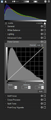
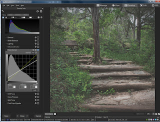
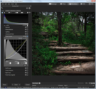
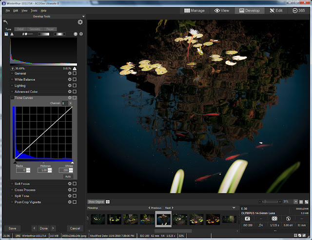
To the Right and above,, is he tone curves control in the ACDSee Ultimate 8 Raw development tab. It has all the conventional functionality found in most tone curve controls and a few things added to make it more useful for raw development processing.

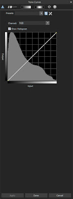
To the left, is the tone curves control found in the ACDSee Ultimate 8 Edit tab. It too has all of the conventional functionality found in most tone curve controls but without the raw development considerations of of the Development tab.

Now, the question as to why there are two separate tabs in ACDSee that offer many of the same controls is beyond the scope of this tutorial. At this point, let's just say that some photographers who use jpg and tif based photos sometimes find it easier to deal with them without having to worry about the raw development tools complicating their choices.

For this tutorial, we can use either, or some other software completely, for that matter, and it won't make much difference. I personally prefer to use the Development tab controls whenever possible,


Before we get involved with the changes we intend to make, lets first discuss the controls we see in the tone curve control group. The first, most obvious, is the curve display itself.

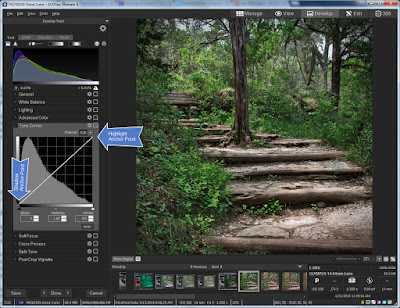
Note there are two default anchor points on the diagonal line that represents the tone curve.

As in a live histogram, the left side of the tone curve chart represents the shadows, while the right side of that same chart represents the highlights, and of course, the area in the middle is what we call the mid-tones.

But in the typical tone curve control set up we also have the luxury of moving those control points and any control points we subsequently create, up and down as well as left and right. If we are trying to control lighting, the up and down movement controls how light or how dark those shadows, mid tones, and Highlights are.


Also remember that if we are trying to control the intensity of one or more of the color channels, that is, the Red, Green, or Blue channels which make up ALL of the other colors we see, that up and down movement of the control points controls color intensity.

Note the little Drop Down box next to the word “Channel:”.  There are 4 options, "RGB" which combines all 3 channels into a single brightness channel, and then an “R” for Red, a “G” for Green, and a “B” for Blue. These three primary colors combine to control every color available in the photo!

With these channels I can tell the Tone Curve Control to adjust brightness in specific areas of the chart, or by individually controlling the level of color intensity for each channel, I can control the tinting and shading of all the colors

Lets play with the up and down and left right movement a little bit. Note that when I grab the default shadow and move it up towards the top of the chart, while leaving it at the furthest left most horizontal position, the photo gets a little washed out.


That's because I'm saying to the editor, "Hey editor! I care about ALL the shadow that is in this photo, however I don't want the blackest part of the shadow to be as dark as it is! Lighten things up a bit for me will you?"

Now when I leave the shadow anchor point alone but move the Highlight anchor point DOWN, notice that the contrast goes down compared to what it was. Thats because we are telling ACDSee Ultimate 8 that we want the highlights to be LESS bright.

Let's try one more thing, move the shadow anchor point to the right. Note the odd situation of a sort of dull High contrast combination. This is because moving the Shadow anchor point to the right tells ACDSee Pro 8 (or Ultimate 8) that we only care about the shadows to the right of the anchor point. ACDSee will only do its best to display detail reflected to the right of the anchor point. Everything to the Left of the anchor point is allowed to full black.


Let's have a little logic test. What do you think will occur if we move the highlights Default anchor point to the LEFT?

If you answered that the contrast would go up, then you would be correct. The reason is, that We are telling ACDSee Ultimate 8 (or Pro 8) that we only care about the highlights to the left of the Highlight anchor point. ACDSee will only protect the detail to the left of the anchor point and allow the highlight detail on the right of the anchor point to display as WHITE.


But of course, as I mentioned earlier, We can create our own anchor points. Let's reset the Tone curve controls to their original default setting. We can do this by clicking on the little 'gear wheel' in the Tone curve window which resets only the tone curve controls; OR clicking on the larger 'gear wheel' at the top of the screen. This wheel resets ALL controls, not just the tone curve controls, to their default settings. In this particular case, either window will work for us, since the only changes we have made are to the tone curve controls.

To create a Tone curve anchor point, merely click on any point in the Tone Curve chart. You can click on the default curve line itself and drag it to the location you want, or you can click on any area of the chart and the curve will adjust itself to to where ever your cursor is pointing.


You can do this with the Channel called RGB, which is effectively the brightness channel, Or you can select either “R”, “G”, or “B” and adjust them manually.

Now this is pretty much the operational theory behind the various Tone Curve controls for almost every software package on the market. If you understand what we've done so far, You should have very little trouble using any Tone Curve control you encounter.


How to achieve that 1960's, Washed Out Old Photo Look.

Now let's do something practical! AS promised I will show you how to recreate that washed out look so popular right now. And best of all, it is SUPER easy, and super FAST.  Best of all, you don't have to buy any additional software if you already own software with a tone curves control.  I'm bored with the photo we've been using, let's try something else.

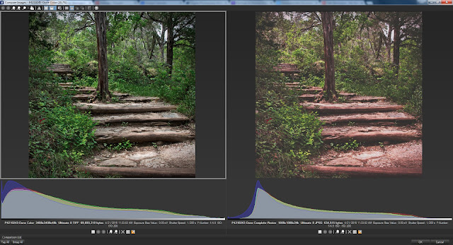
First, lighten the photo, so the deepest blacks are washed out a bit.


I notice that while I like how the blacks are pleasantly washed out, I don't particularly like what it has done to the contrast overall. I think much of this photo's dynamic comes from contrast. But by experimenting, I realize that pulling down the mid tones changes the balance of contrast and I don't want that. 


What I want is to add back at least part of the 'pop' that comes from contrast without getting rid of the washed out look of the shadows.  So I then created a new control point a bit past the mid tones and pulled the curve up a bit. This allows me to have a washed out look with a bit of pop in the contrast.

This is almost right, but we really haven't accounted for the slow deterioration of the color dyes in an old photo. As a result, I brought up the Red channel a bit. If you so chose, you could replace Green with Red, or combine Green with Red to go with a more yellow look, if you so chose. That's a question of your artistic judgement.


That's it! This short tutorial has not only given you a guided tour of ACDSee Pro 8 and Ultimate 8's Tone Curves control, but gave an example of how the control can be used for a specific effect. I hope you have found it useful.